Lock Screen Apps
I led the design and development of all Lock Screen Apps at Sliide, driving over 90% of overall revenue
At Sliide, I played a crucial role in developing and expanding the Lock Screen Apps product suite, adapting to the evolving market needs and aligning with strategic goals. My work included end-to-end design, strategic decision-making, and mentoring, all aimed at driving revenue growth and user engagement in the US market. The success of these apps has significantly impacted both MNO partnerships and user satisfaction.
- Strategic Decision-Making and Roadmapping
- End-to-End Product Design
- Managing & Mentoring Design Teams
- Executing Key Product Features and Growth Strategy
- Delivering High Revenue Results and Market Expansion
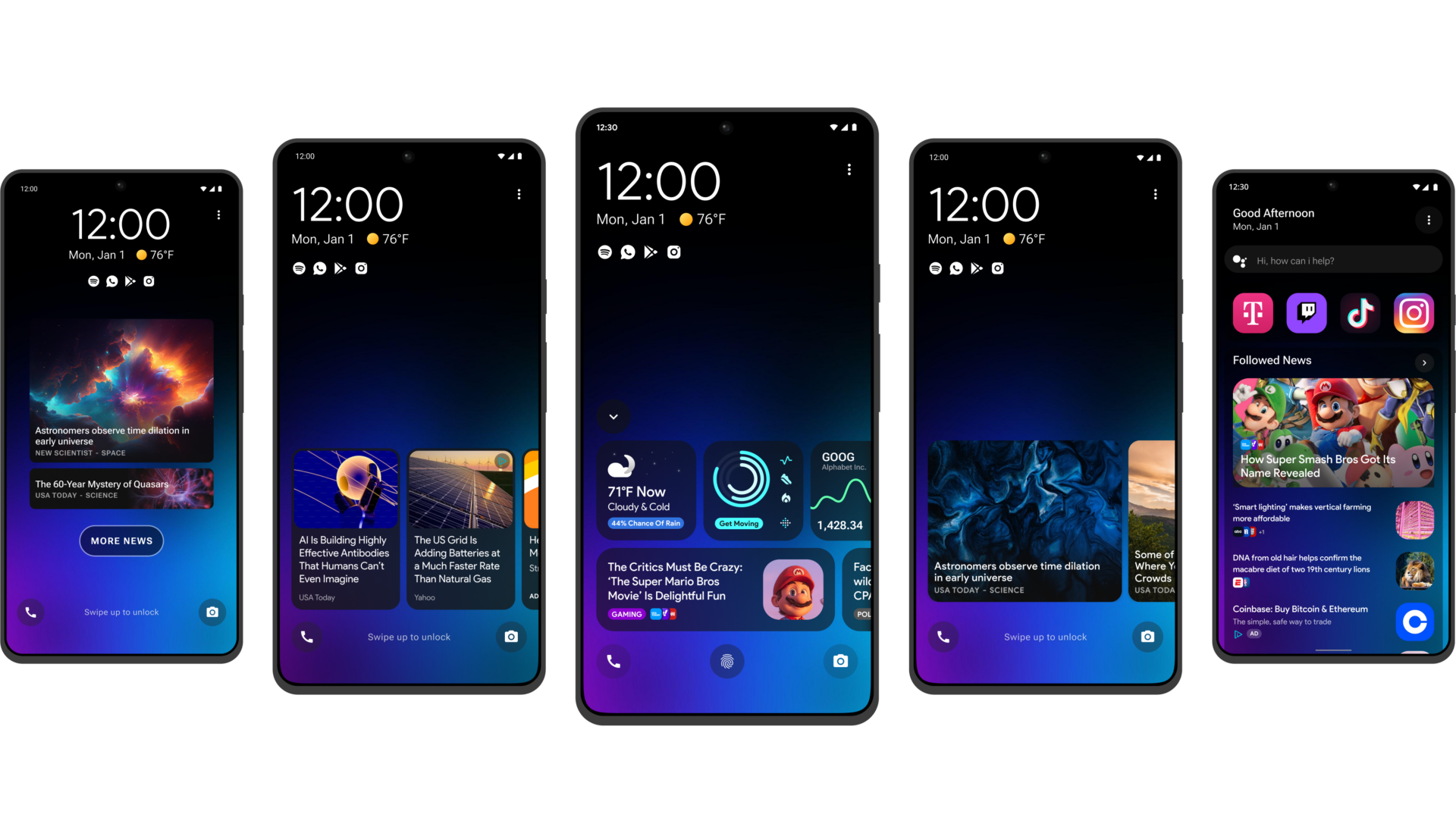
Product Suite
Headlines 2.0
Flick / Flick 2.0
Premium
Concepts
Tablet Support
Success Metrics
£13M+
Yearly Revenue
3M+
Monthly Active Users
20
Partner Apps
£2.60
ARPU
60%
User Retention
15
Articles per Session
Key Initiatives
Here you’ll find a showcase of the key features and initiatives I’ve developed across the product suite. These initiatives highlight the innovative strategies and improvements implemented to enhance user experience and drive engagement. For more detailed insights on each initiative, click the button below to explore further.
UX/UI Improvements
Improved Onboarding
New Content Verticals
Off-boarding & Re-engagement
Content Personalisation
Truly Responsive
Expanded Monetisation
Android Native Support
Customisable Lock Screen
New Features
Ai Content Summarisation
Dynamic Layouts

Lock Screen Consumption
Smart Ai Widgets
App Deep-linking

Weather Integration
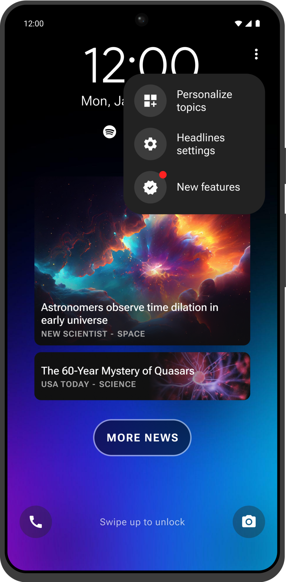
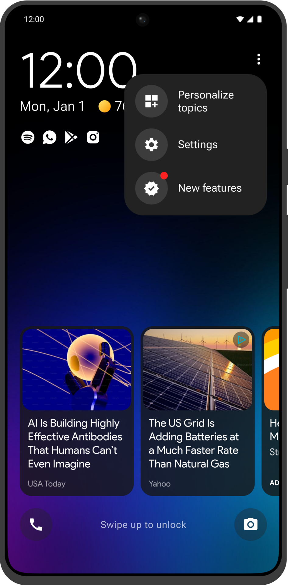
Lock Screen Menu
3rd Party App Integration

Dynamic Notifications
Native and Custom Widgets
Other Initiatives
New Design System
Android Open Source Project
Analytics Integration
Privacy Compliance
Background
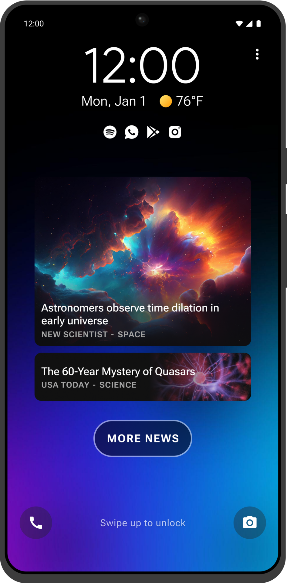
What Is Headlines
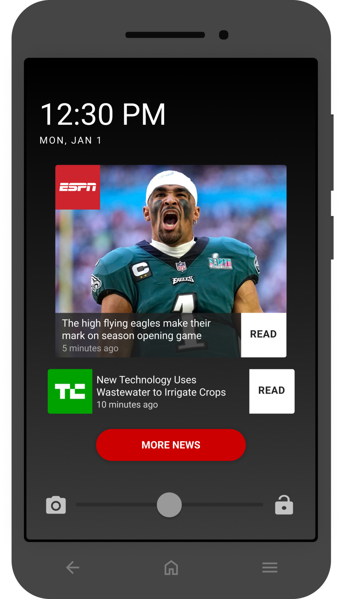
Headlines is an innovative app tailored for the Lifeline sector in the USA, designed to help Mobile Network Operators (MNOs) tap into new revenue streams. It features targeted advertisements and sponsored content on users' lock screens, with a significant portion of the revenue generated shared with the MNOs.
Ideal for low-income families participating in the Lifeline program, Lock Screen provides a convenient way for users to stay informed and entertained, helping MNOs keep subscribers active on their network.
As the first of its kind in the market, Headlines has achieved significant success, generating over £200 million in revenue and engaging more than 4 million monthly users. This accounts for 90% of the company’s total earnings, highlighting its critical role within the company's portfolio.
The Lifeline & ACP Program
The Lifeline Program in the USA provides low-income families with discounted or free telecommunications services, often accompanied with free mobile device to help bridge the digital divide. It is complemented by the Affordable Connectivity Program (ACP), which offers further subsidies for broadband access. Both programs ensure essential communication tools are affordable for all Americans.
- Lifeline Subsidy: Free or up to $9.25 monthly discount on phone or internet services.
- ACP Subsidy: Up to $30 monthly towards broadband, and $75 on qualifying Tribal lands
While mobile carriers offer devices for free to subscribers, they bear the distribution costs. To sustain this model, generating additional revenue is crucial.

Integration & Distribution
Sliide integrates its apps seamlessly across devices using a versatile approach that adapts to various technological environments and partner requirements. By working closely with Mobile Network Operators (MNOs) and Original Equipment Manufacturers (OEMs), Sliide ensures efficient access and integration into devices.
- Over The Air (OTA)
- Firmware (FW)
- Software Development Kits (SDK)
- Android Open Source Project (AOSP)
Lifeline
Headlines 2.0
One of the initial projects at Sliide involved re-platforming and rebuilding the Headlines app to ensure it remained technologically relevant and sustainable. Initially, Headlines was struggling with a legacy codebase, compatibility issues with the latest Android OS, outdated UI/UX designs, and limited data tracking capabilities.
This overhaul aimed to enhance the user experience, boost scalability, and integrate advanced functionalities. Our objective was to develop a future-proof platform that not only continues to deliver outstanding news content but also performs more efficiently with innovative features.
The updated version, Headline v2, not only met our existing performance metrics but significantly surpassed them, improving on every single measure and introducing additional functionalities. This success has positioned the new version as a cornerstone for further innovation and development within our range of Lock Screen products.

Re-Designed From Scratch
New Code Base
Material Design
Analytics Integration
New Design System
Product Evolution
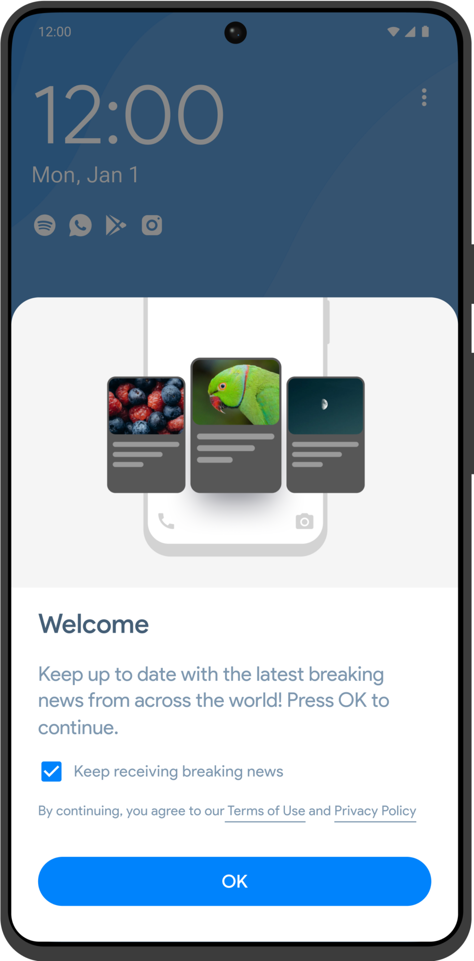
As part of our commitment to continuous improvement, we made the strategic decision to move from Headlines Classic to the next version, Headlines 2.0. Starting from scratch, we conducted a series of stakeholder interviews, including user feedback, to guide the development of this new version. Headlines 2.0 offered a significantly enhanced experience compared to its predecessor, serving as a strong foundation for future iterations. This migration marked a pivotal point in the product’s evolution, setting the stage for continued innovation and growth.
User Feedback
Through a series of user interviews and tests, we identified several pain points that guided our redesign of Headlines Classic. These insights allowed us to make targeted improvements, ensuring the app aligned closely with user expectations and preferences, creating a more intuitive and enjoyable experience.
- Customisation Options
- Native Unlock Mechanisms
- Lock Screen Shortcuts
- Enhanced UI
- Accessibility Support
- And Many More...
Re-Designed UI/UX
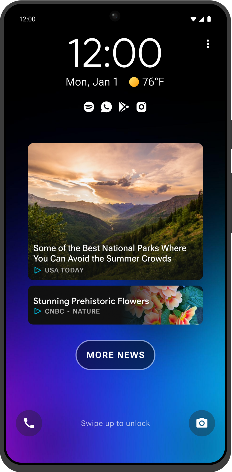
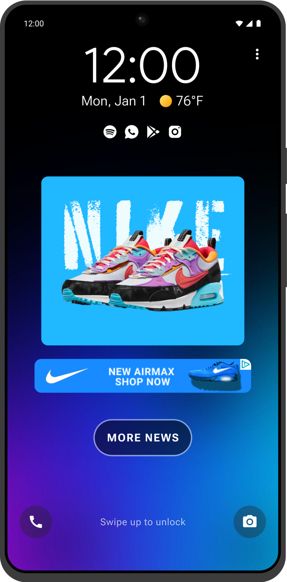
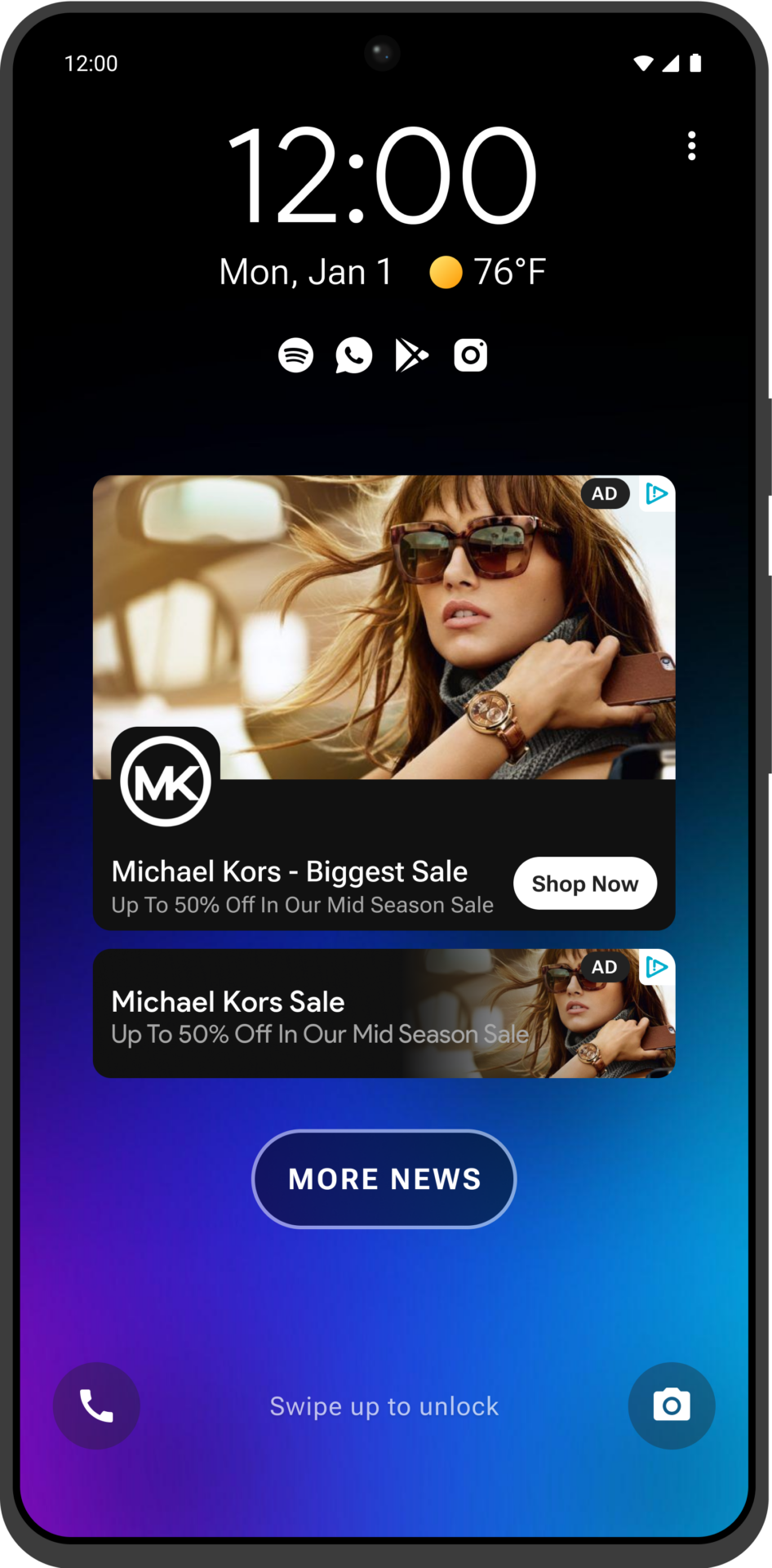
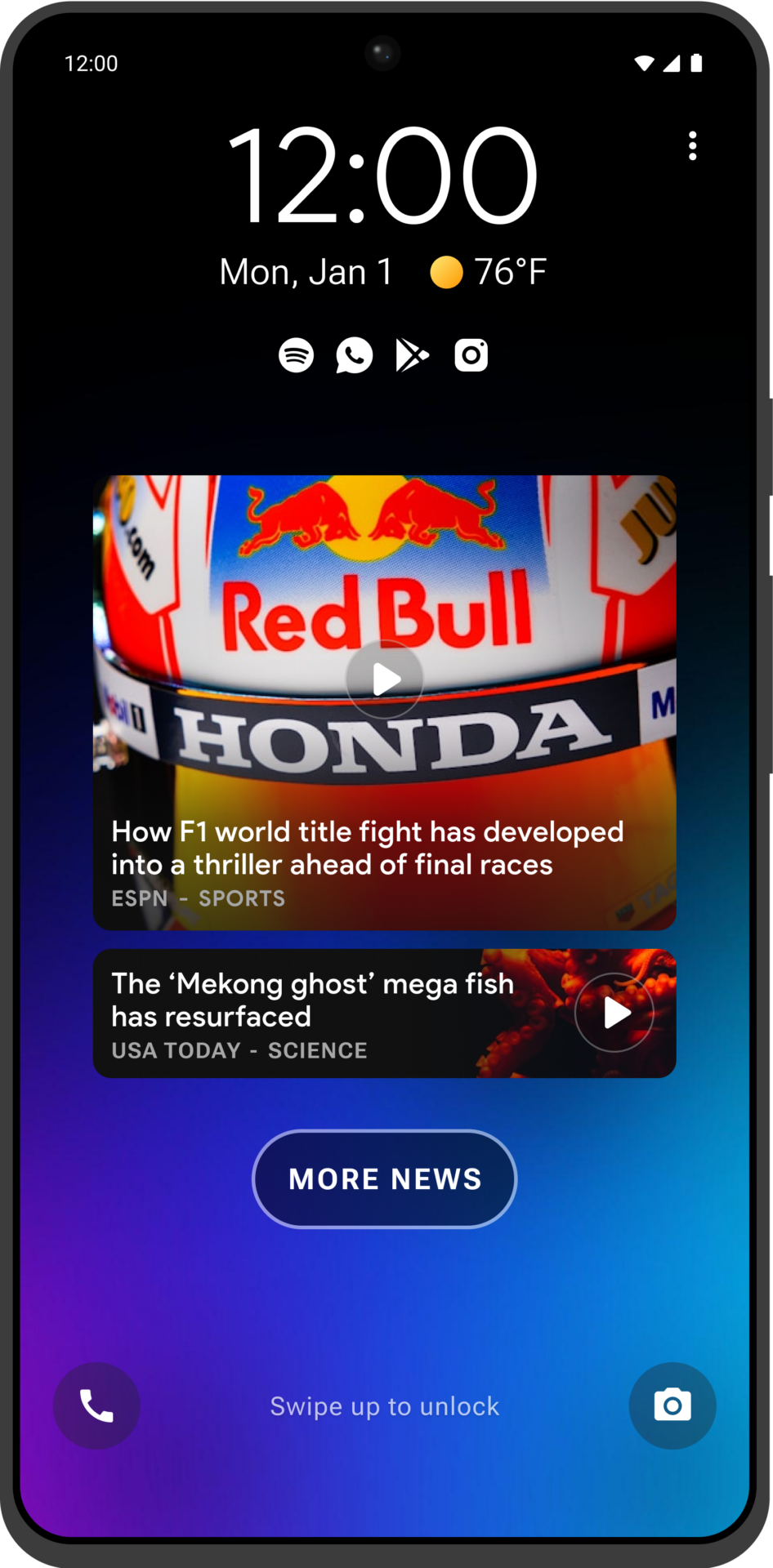
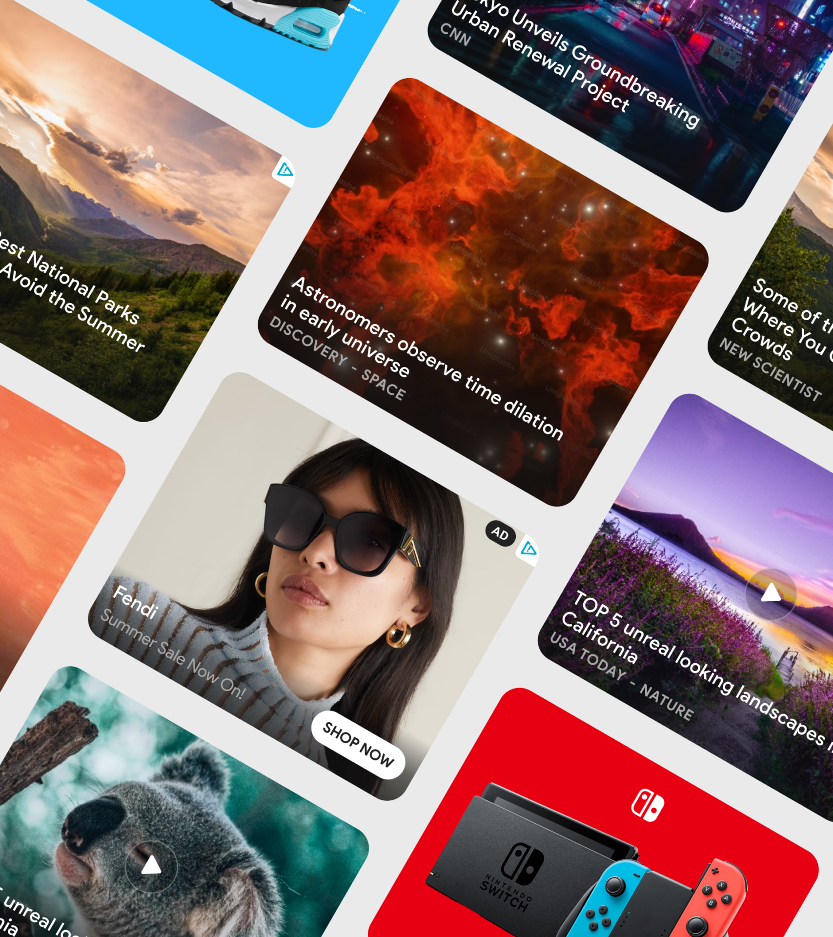
We undertook a comprehensive UI/UX redesign with a strong emphasis on content cards to optimise user engagement and monetisation. A key part of this process involved conducting multiple A/B tests to experiment with different card layouts. These tests had a significant impact on our KPIs, helping us identify the best-performing designs. The refined content cards led to higher user interaction and improved monetisation metrics, reinforcing the importance of data-driven design choices in shaping the product’s success.
- New Content Cards UI + A/B Testing
- New Content Verticals
- Android Native UI & Features
- Native Wallpaper Support
- White Labelling Support + Custom Flows
Lifeline & Tier 2
Flick
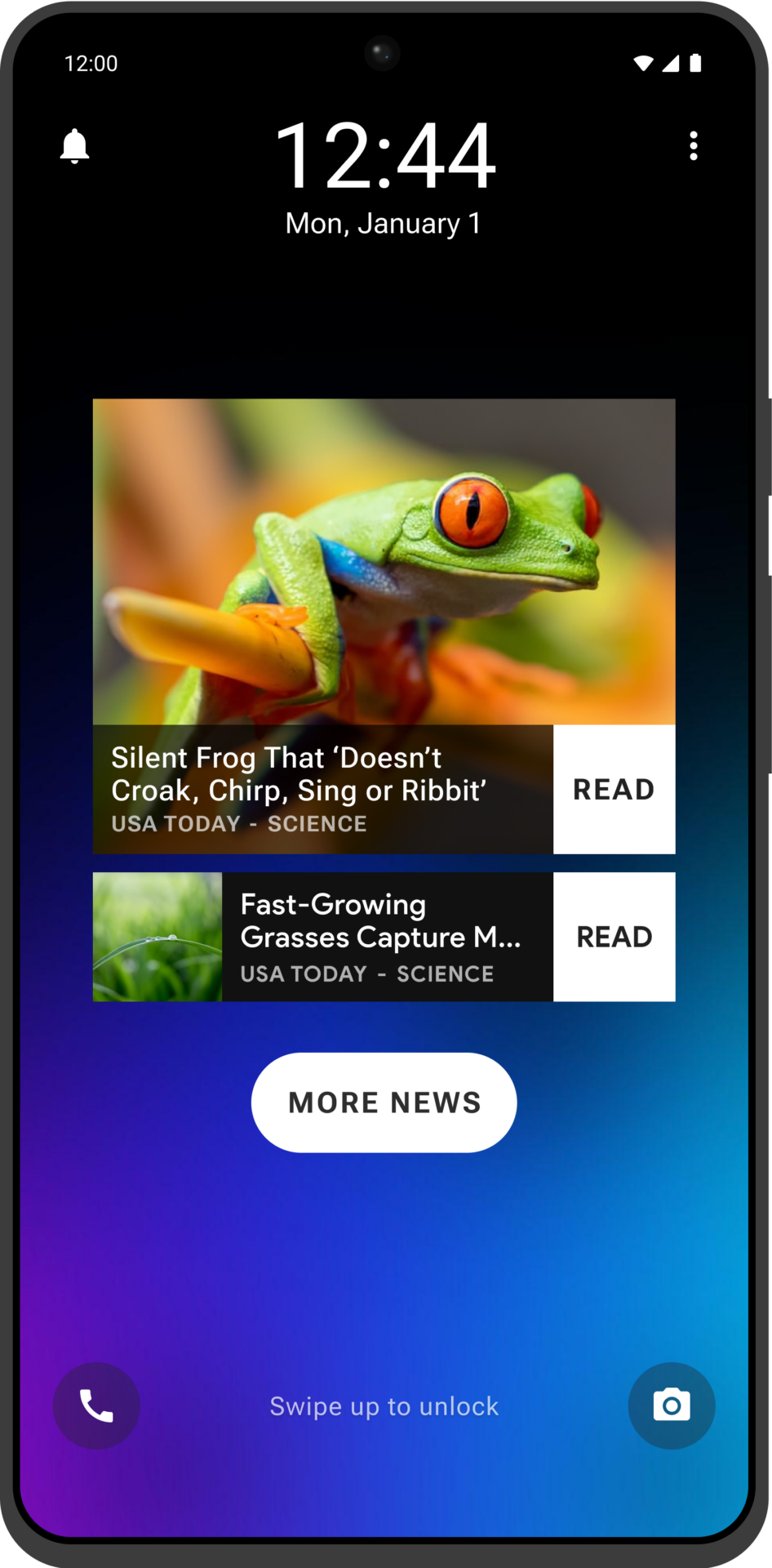
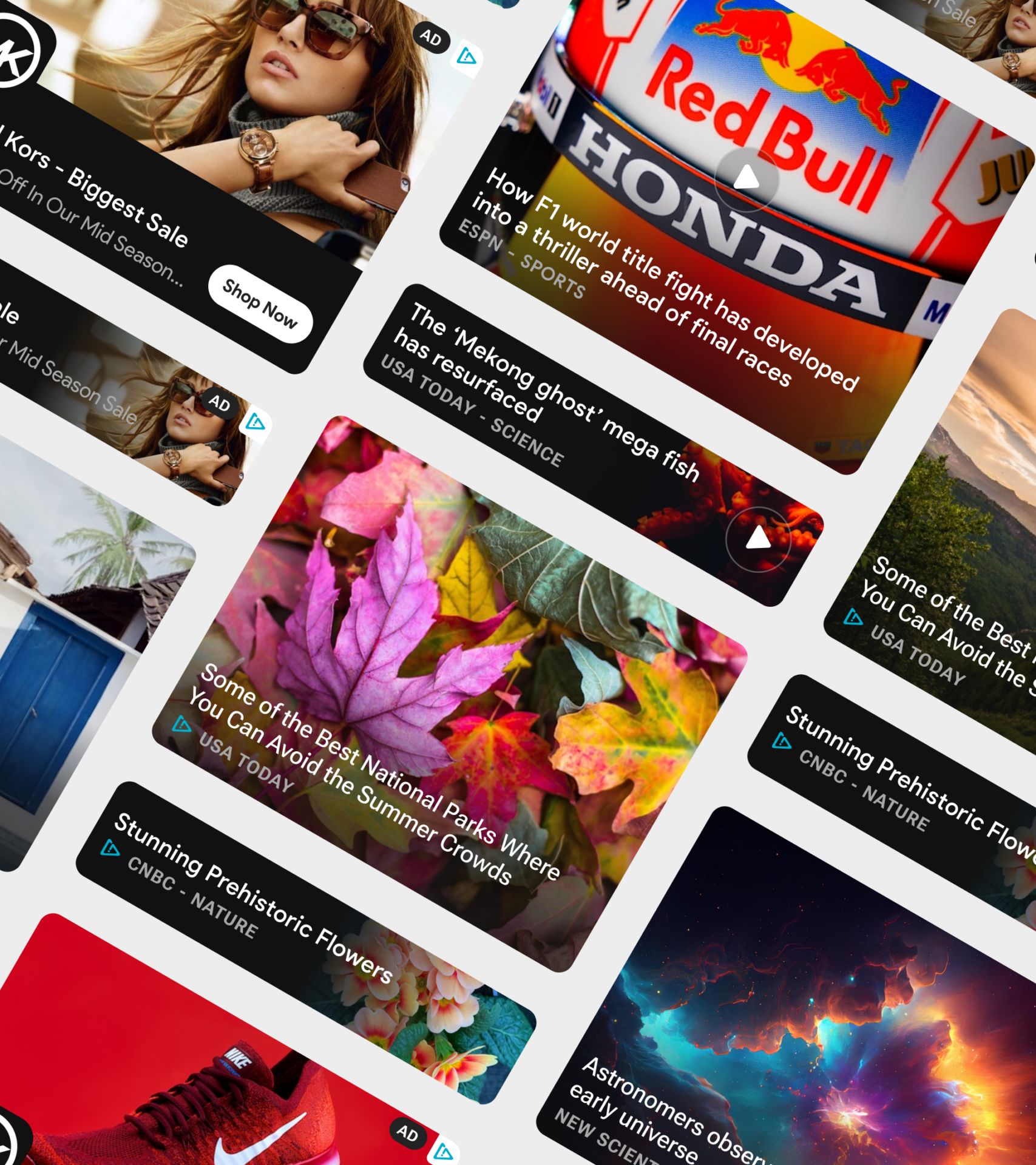
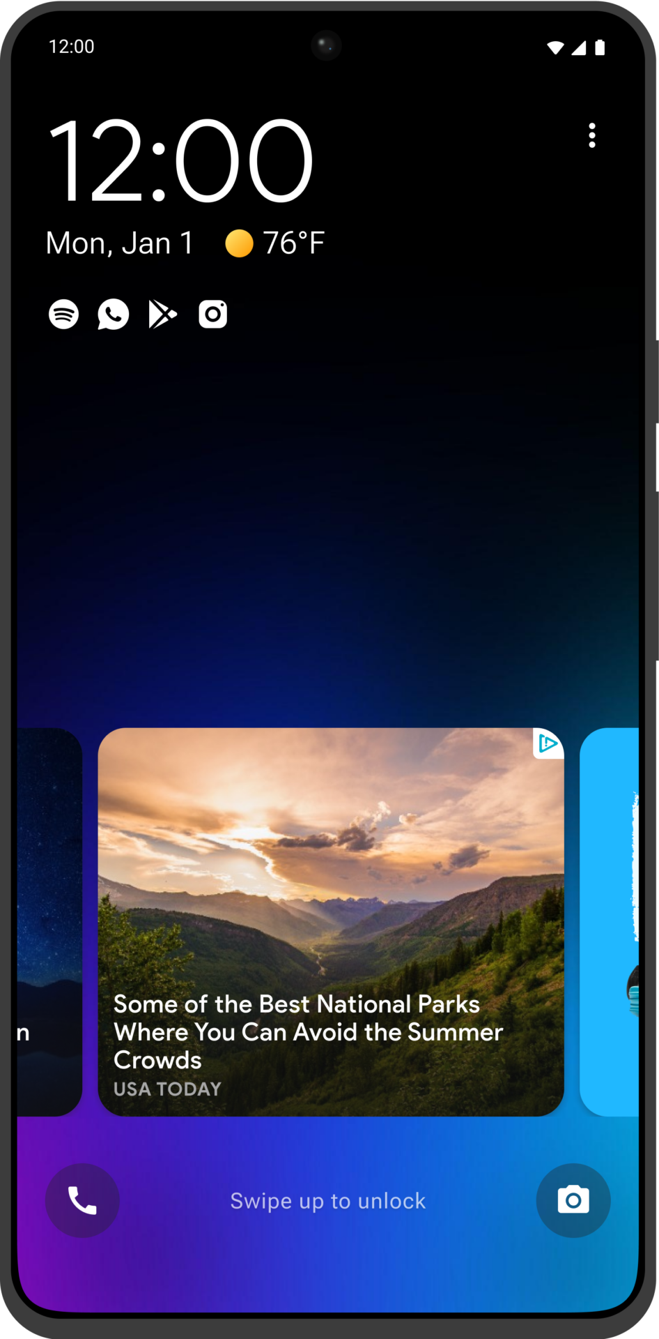
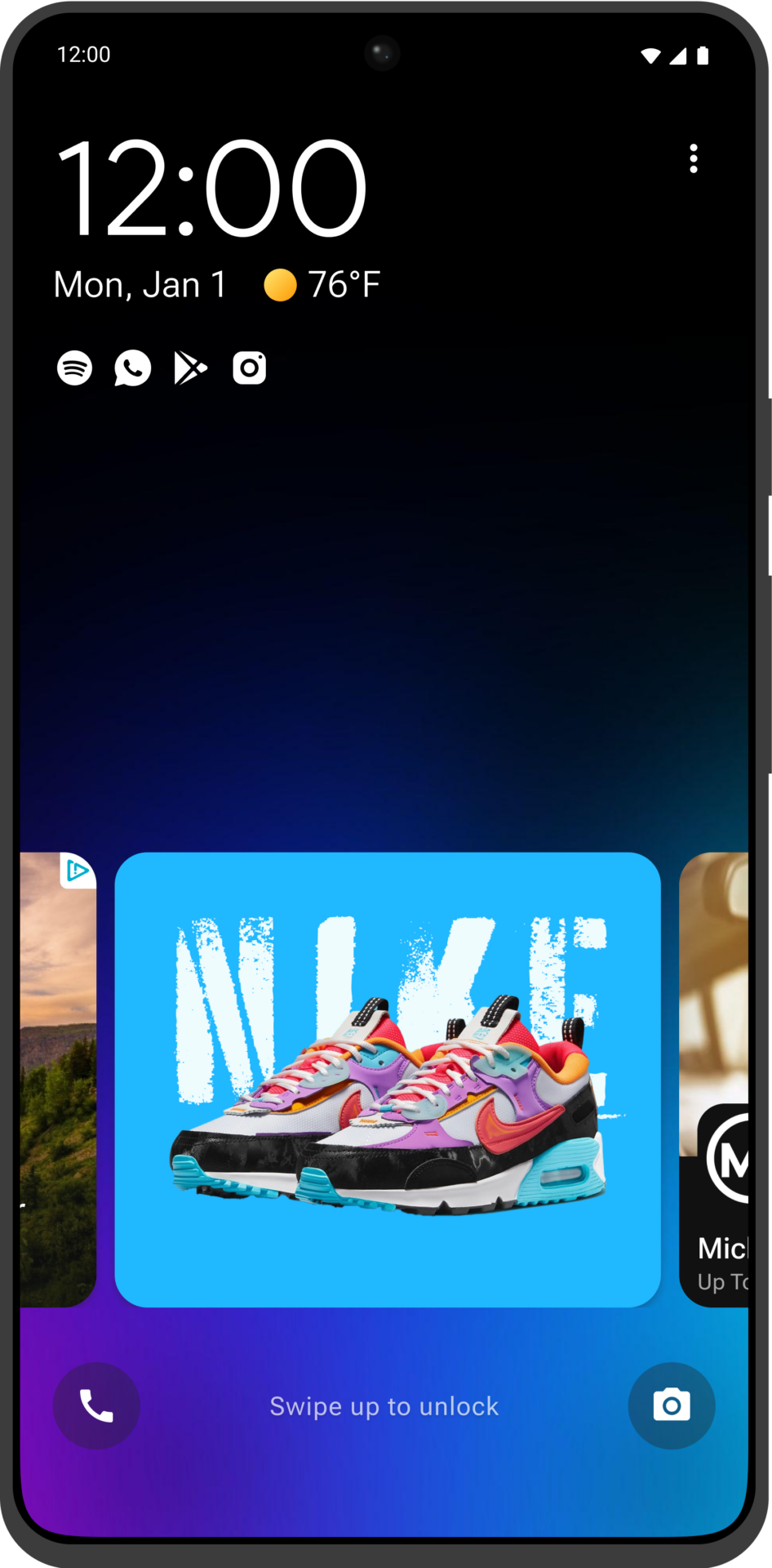
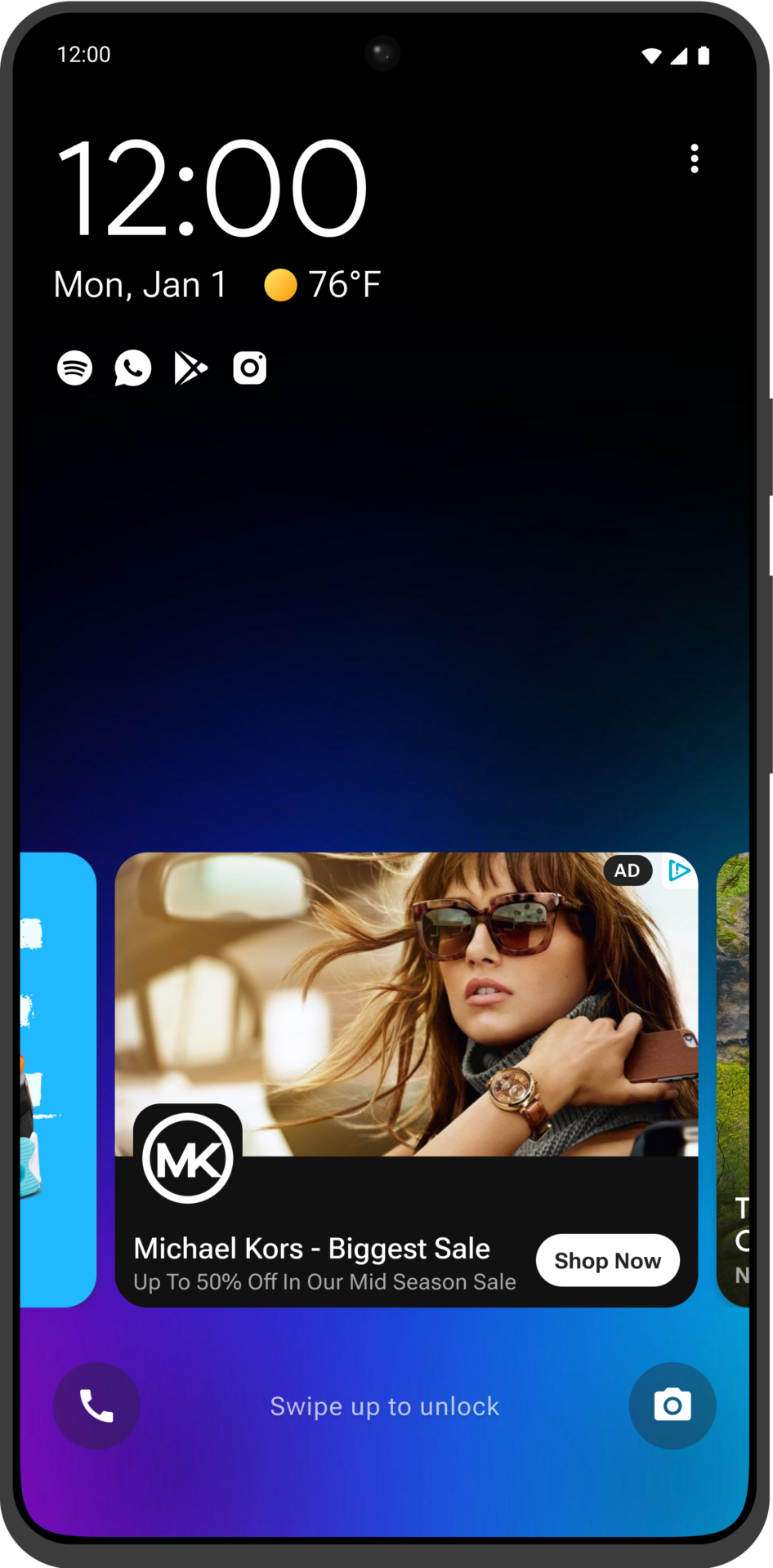
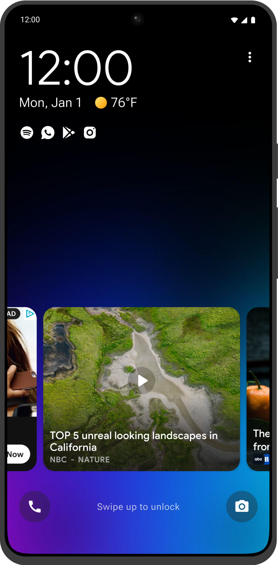
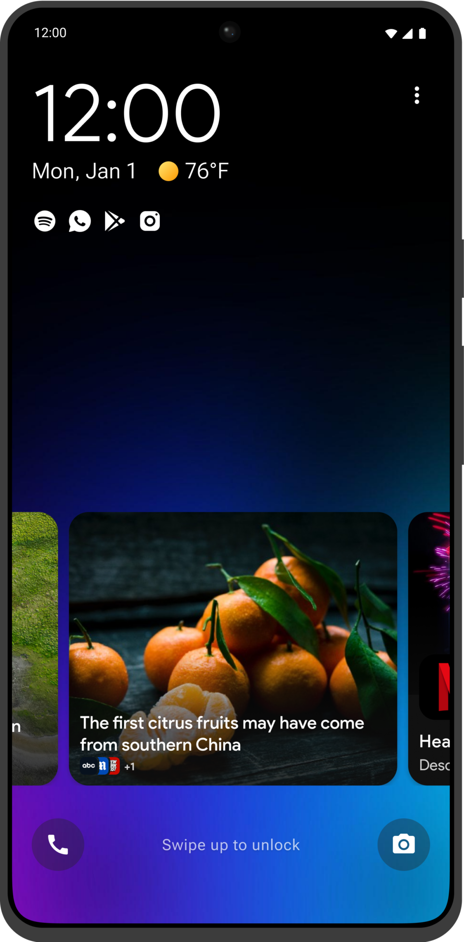
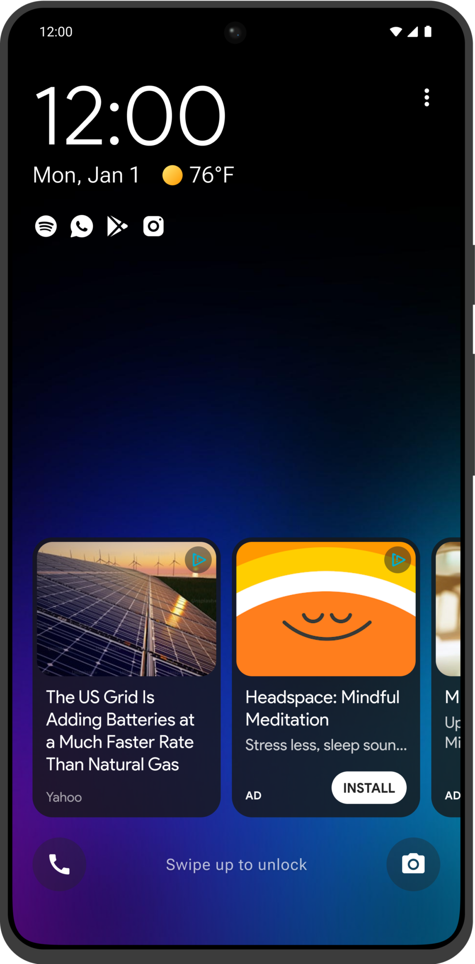
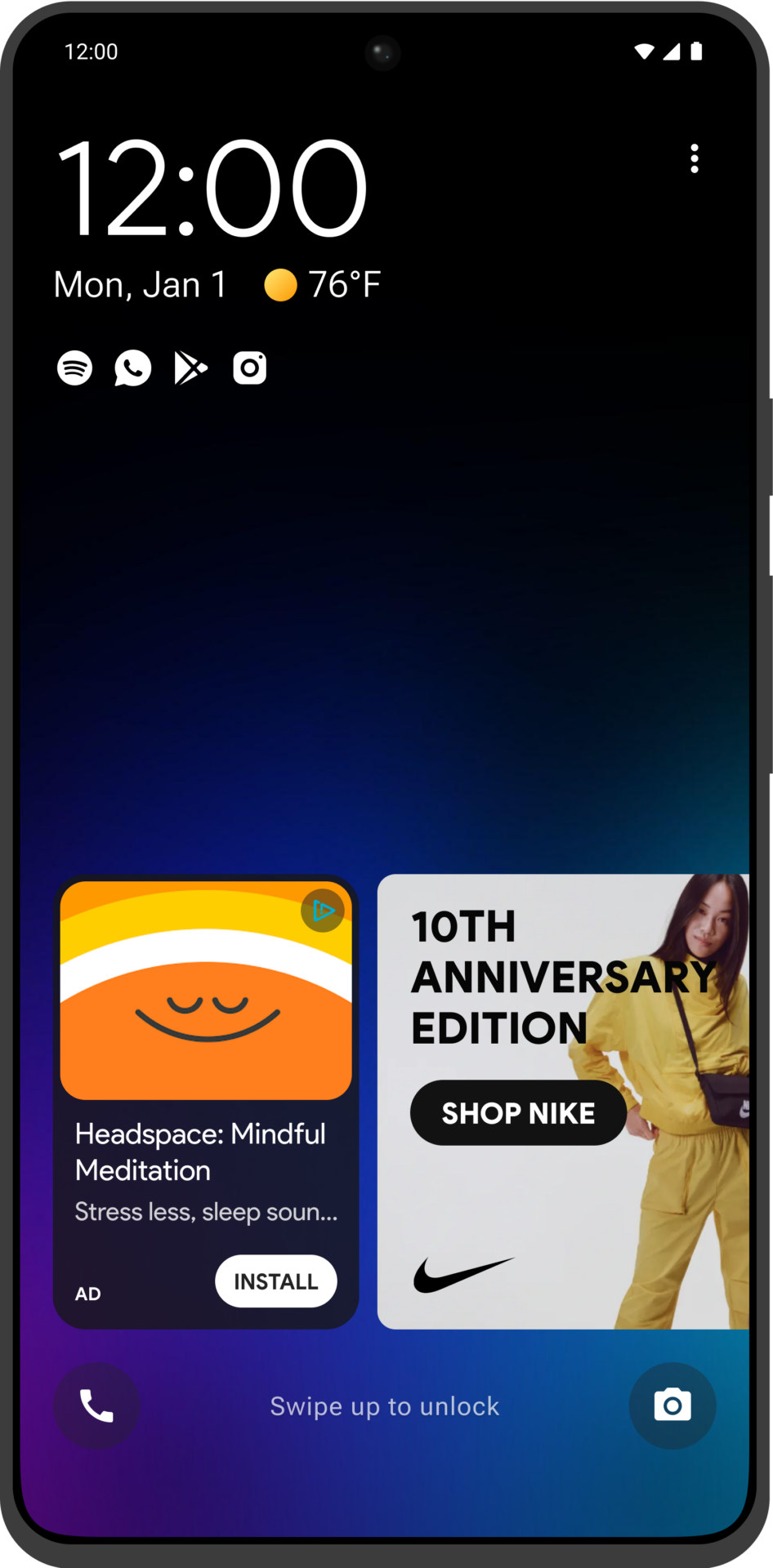
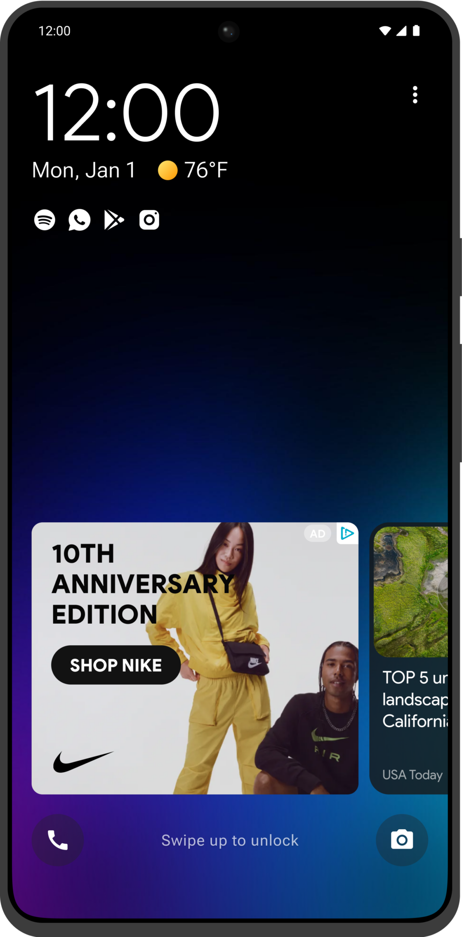
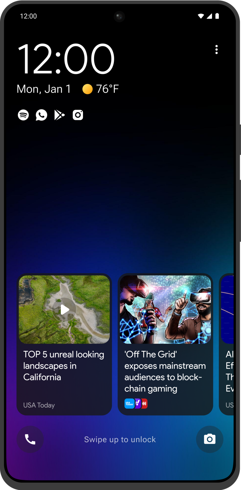
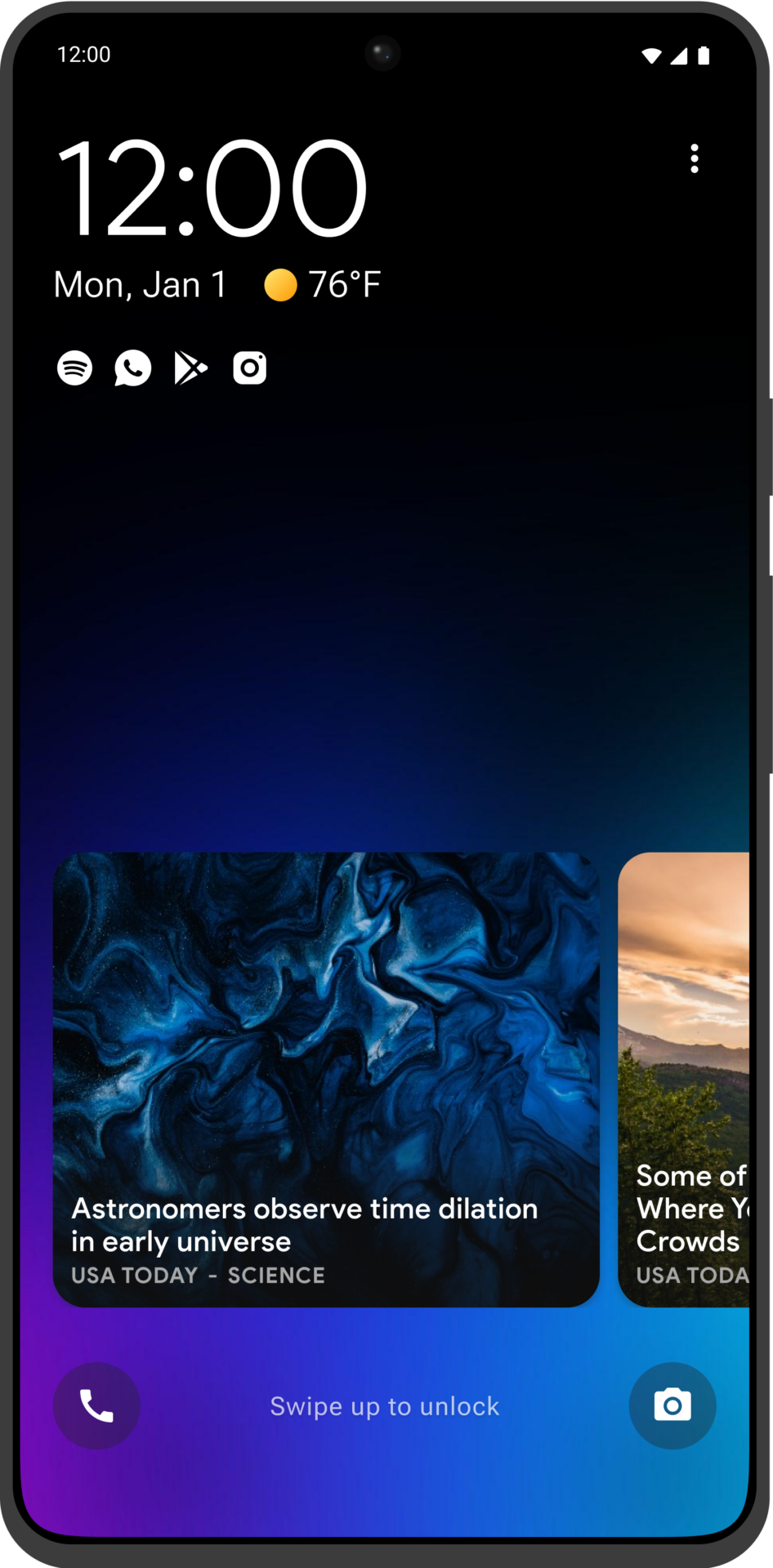
Introducing Flick, the evolved version of the Headlines product, tailored for the Tier 2 and prepaid markets. Flick enhances the user experience by enabling effortless content swiping instead of tapping, creating a more engaging and intuitive interface. This design emphasises user engagement over the aggressive monetisation strategies typical of the Lifeline market.
Flick was developed in close collaboration with our partners and shaped by comprehensive user research, ensuring it meets the specific needs of Tier 2 users. This approach not only improves user satisfaction but also strengthens our competitive position by enhancing lock screen functionality and maximising device utility.
The launch of Flick has led to significant improvements in user engagement metrics and has been positively received by both users and partners, affirming its success in the market.

Infinite Swiping Carousel
New Content Verticals
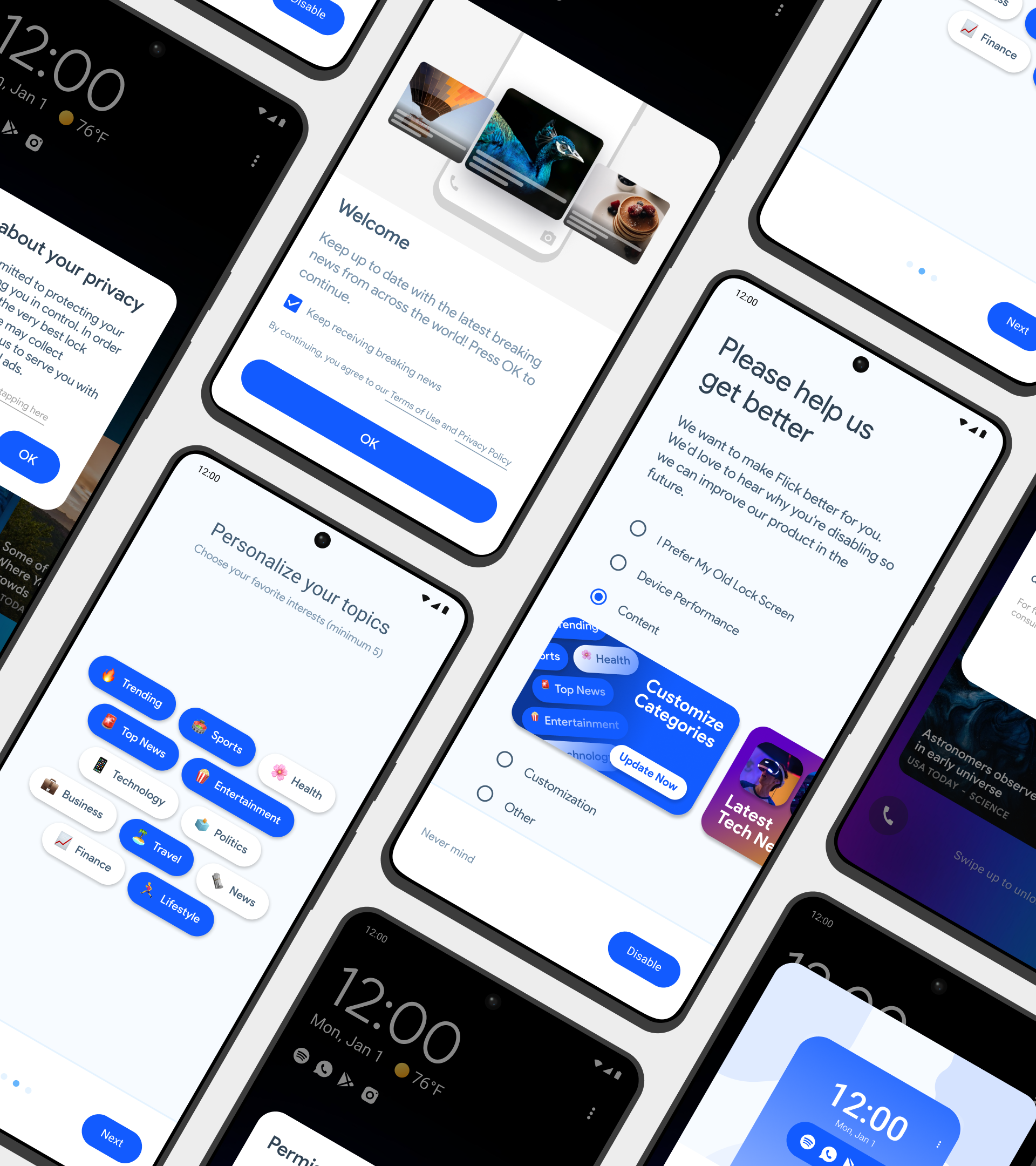
Re-designed On & Off-Boarding
App Deep-Linking
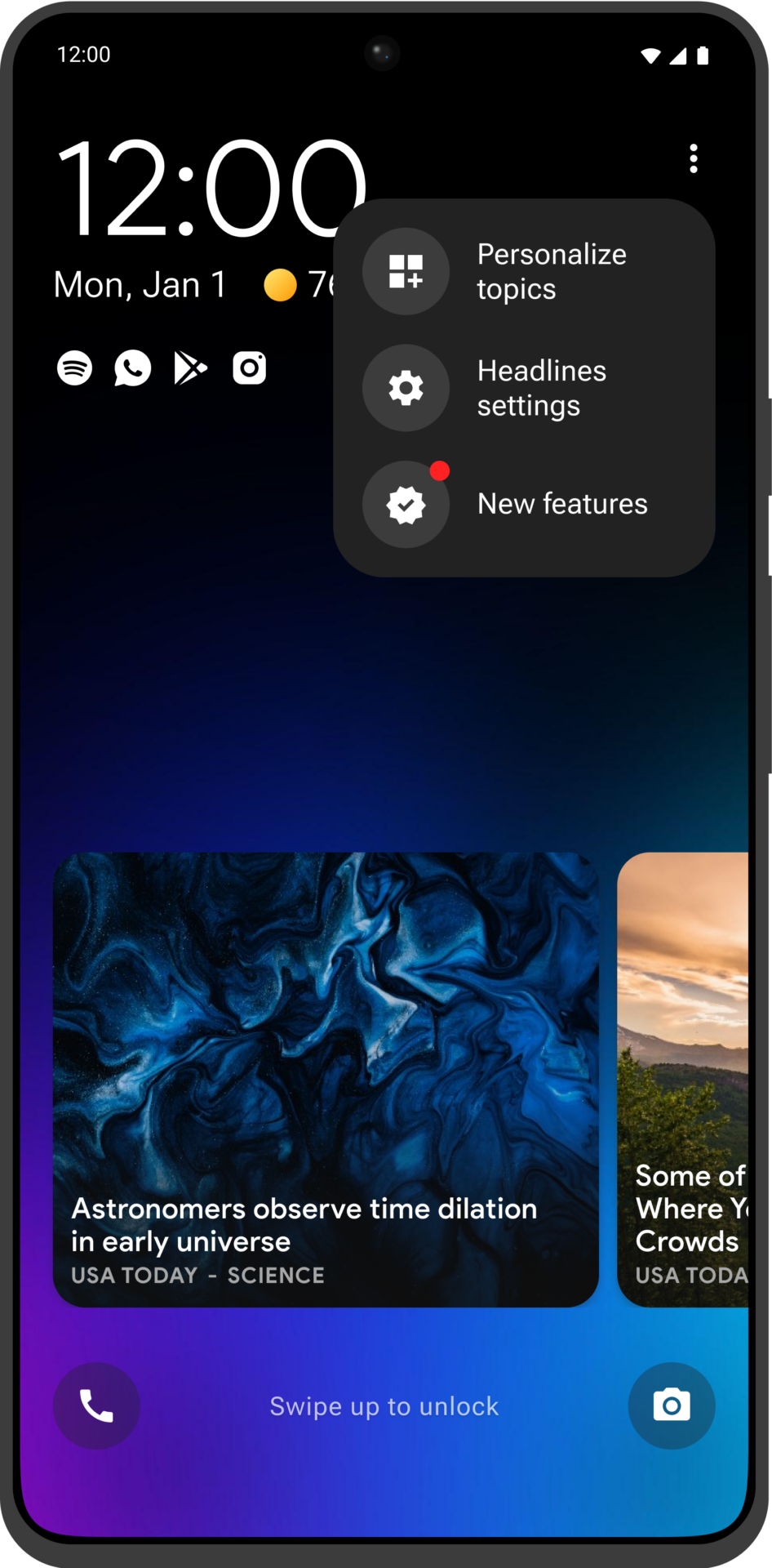
Lock Screen Menu
Carousel Swiping
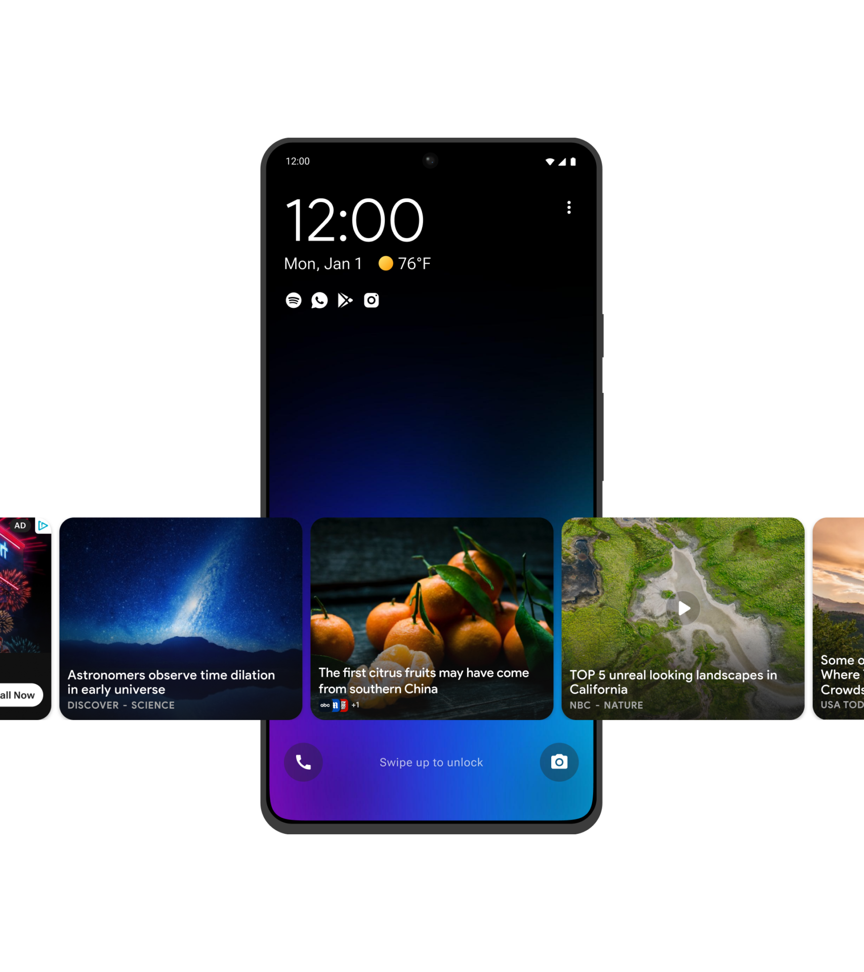
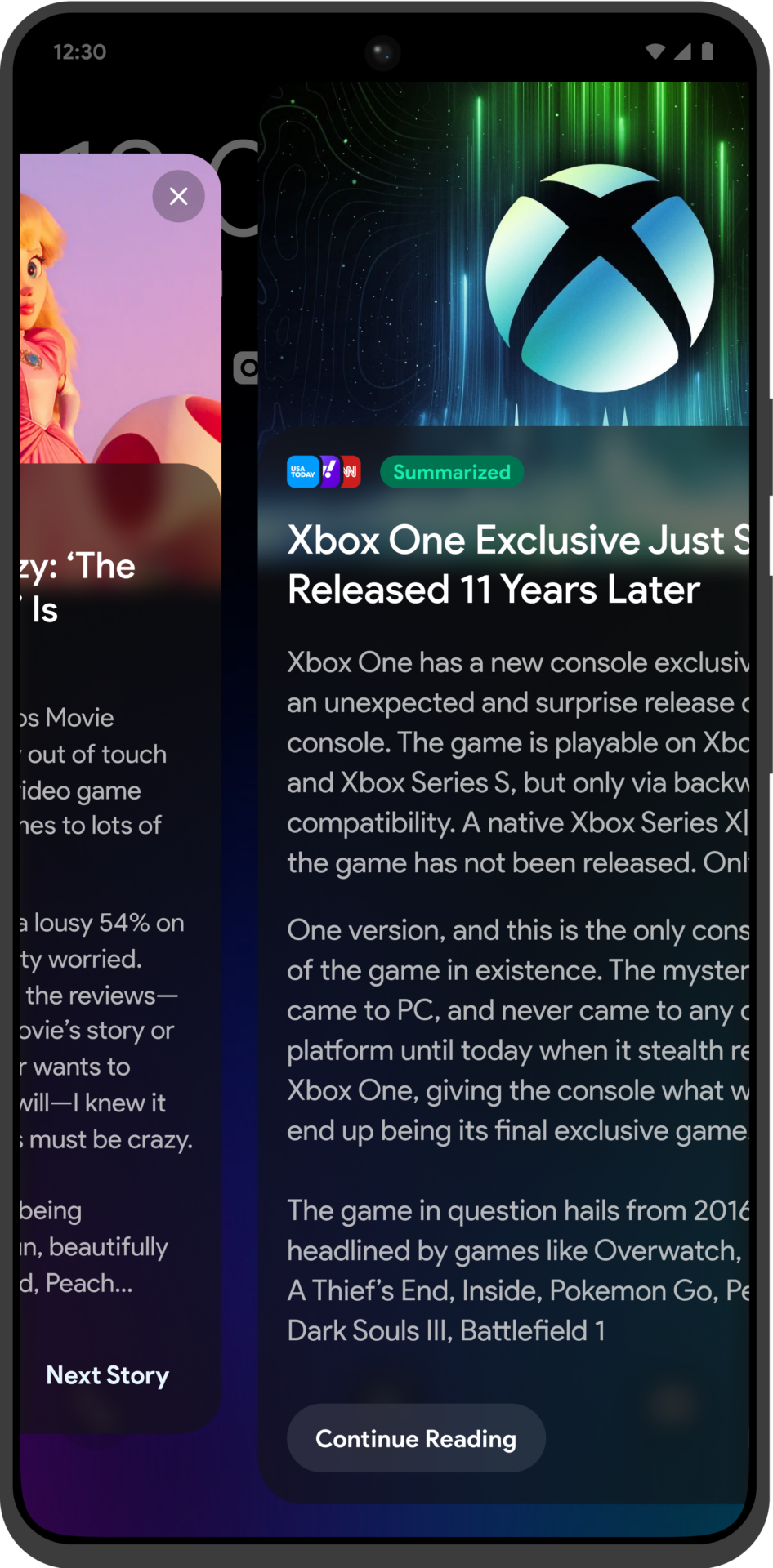
We introduced a swipe-able carousel, allowing for a smoother, more intuitive browsing experience. The new UX/UI enables users to easily swipe through content in both directions, enhancing usability while increasing monetisation opportunities. A key focus was to make the interface friendlier and more accessible for Tier 2 users and partners. Utilising technologies like lazy loading, we created an infinitely scrollable carousel, boosting content delivery efficiency and refining our overall content strategy.
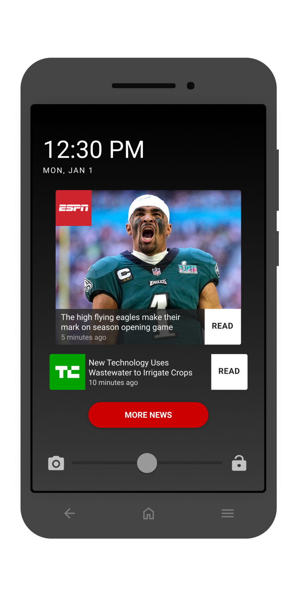
Content Cards
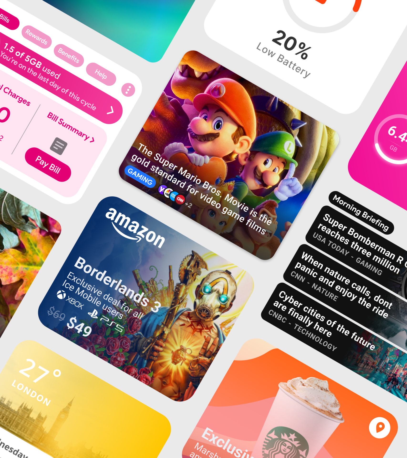
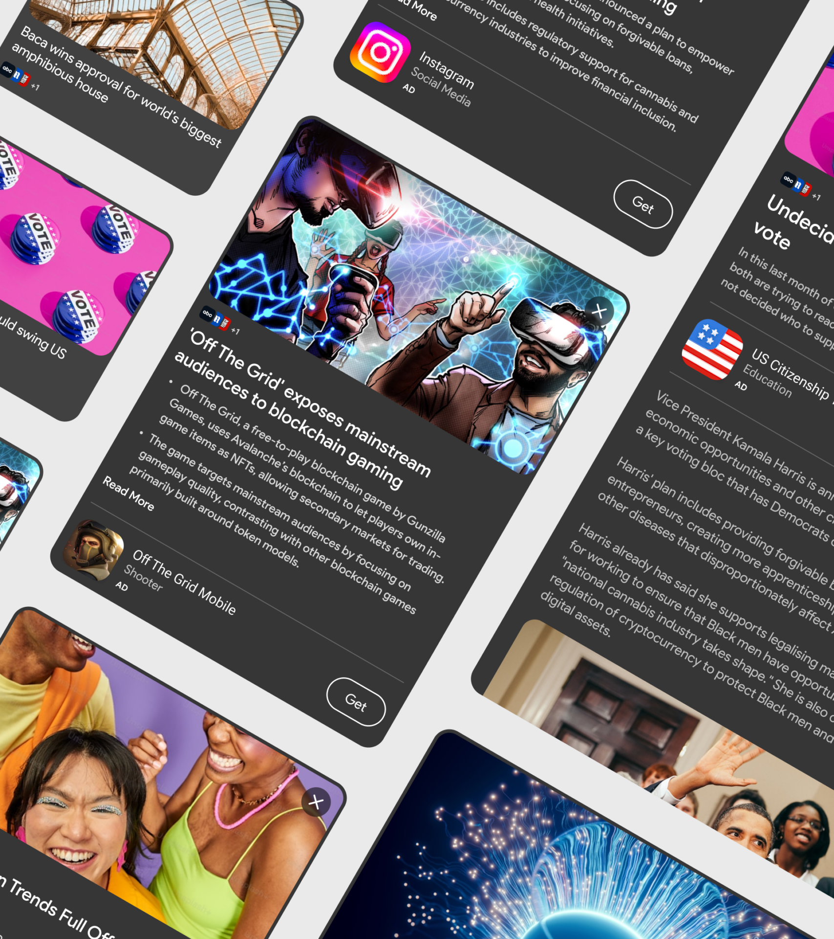
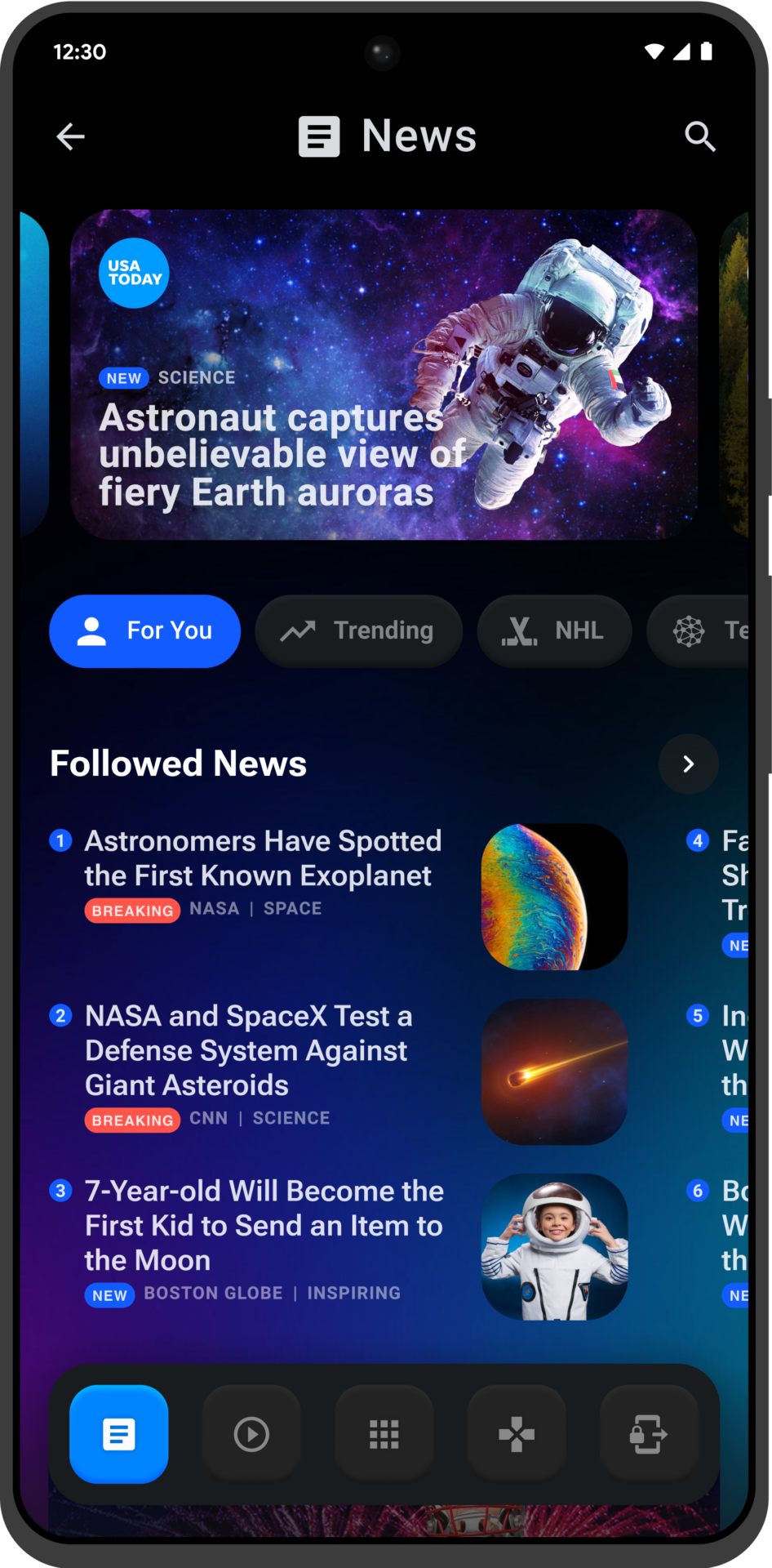
The Flick MVP is built around five core content verticals, ensuring a streamlined and user-friendly experience. This structure allows for easy integration of future verticals, enhancing the app’s adaptability and scalability. Current content includes:
- Editorial Content
- Video Content
- Sponsored Content
- Display Ads
- Native Ads
Future updates will introduce new features to enhance engagement and meet evolving user needs, including affiliate links, localised weather, grouped news topics, location-based offers, MNO alerts, and more diverse content providers.
On / Off-Boarding
For Flick, we completely revamped the on and off-boarding experience to adopt a more user-centric approach. Aiming to maintain high opt-in rates and achieve key metrics, we implemented a multi-faceted strategy with customisable options tailored to partner needs. From user testing, we identified the importance of flexibility, allowing for unique onboarding and off-boarding experiences. Additionally, a new re-engagement feature provided multiple opportunities for users to sign up, leading to significant KPI improvements across the product.
App Deep-Linking
As our product suite grew, multiple Sliide apps often coexisted on a single device, allowing for unique interactions that boosted user engagement. A key innovation was introducing app deep linking from the Lock Screen, seamlessly connecting user actions to other apps in the ecosystem. This strategy kept users engaged across our products, improving transitions and significantly increasing monetisation and engagement metrics. By maintaining engagement both on and off the Lock Screen, we saw higher retention and usage, showcasing the power of deep linking in creating a cohesive app experience.
Tier 2
Flick 2.0
To enhance user engagement and appeal to higher-tier MNOs, we shifted from a primarily display advertising revenue model to one that focuses more on user interaction for our next iteration of the Flick product. This strategic move away from display ads has given us greater flexibility in the product’s UI design, allowing more content visibility on the screen. This change has positively impacted our metrics, showing significant uplifts across the board.
Our Tier 1 partners were particularly enthusiastic about this approach, as it aligns with their preference for less aggressive visual and monetisation strategies. They feel that this new model better represents their brand and their partners’, enhancing the product’s appeal in the competitive market.
Ai Content Summarisation

Lock Screen Consumption

Dynamic Notifications

Weather Integration
Customisable Lock Screen
AI Content
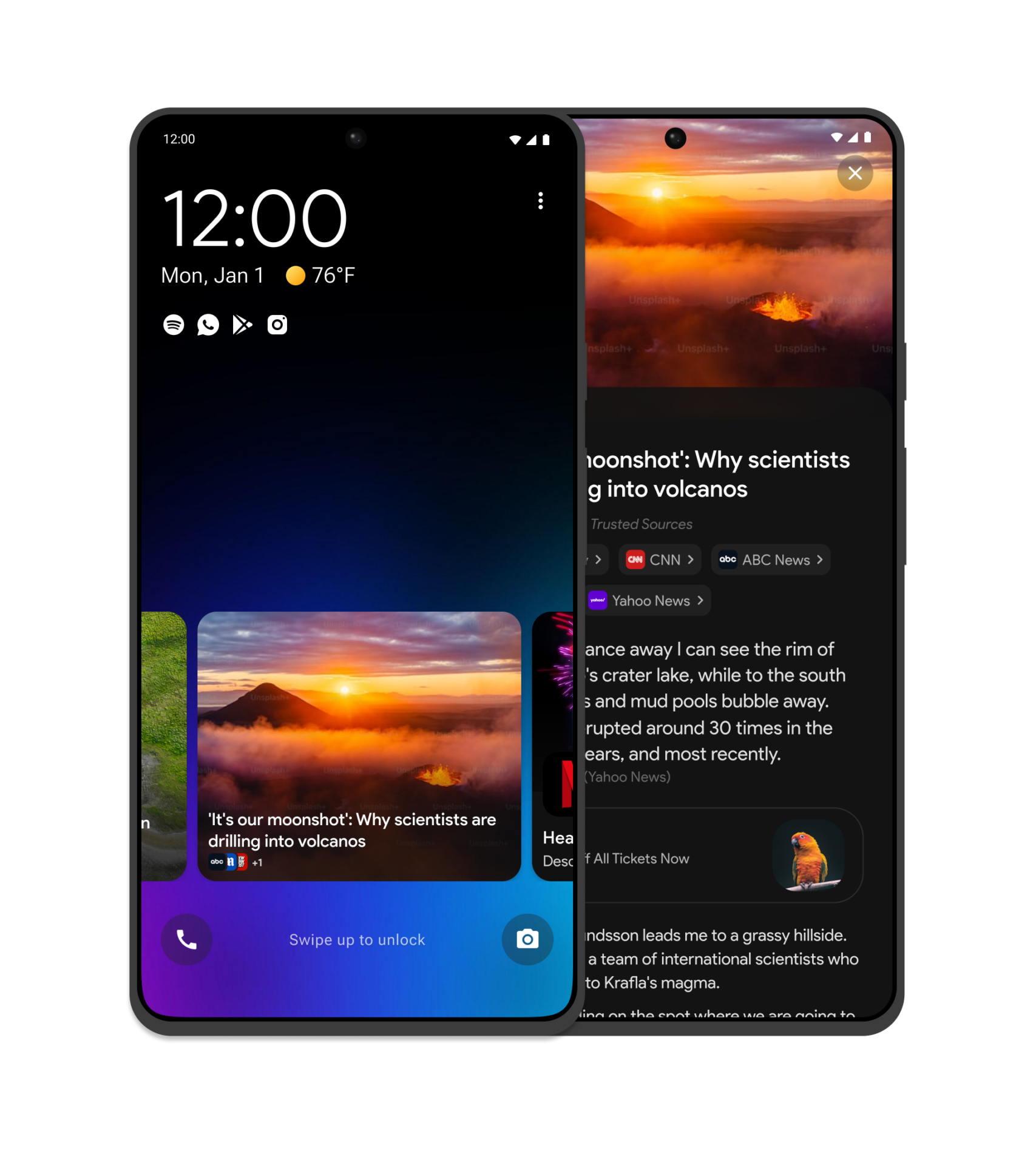
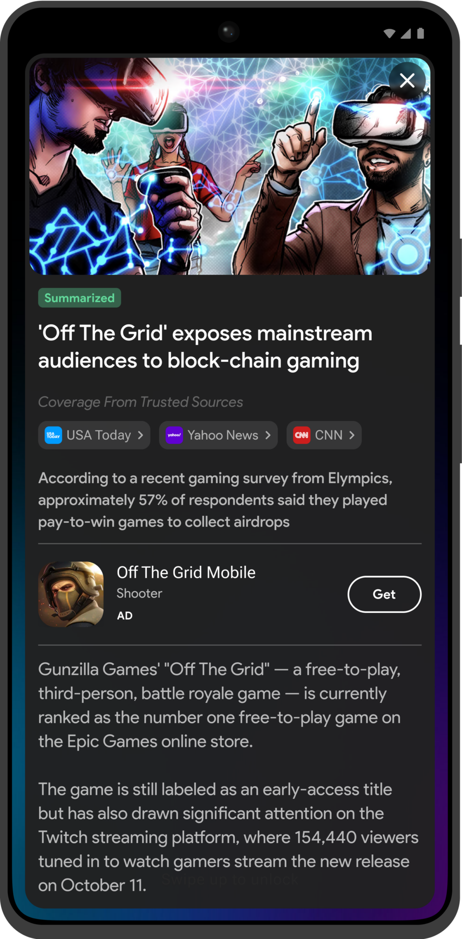
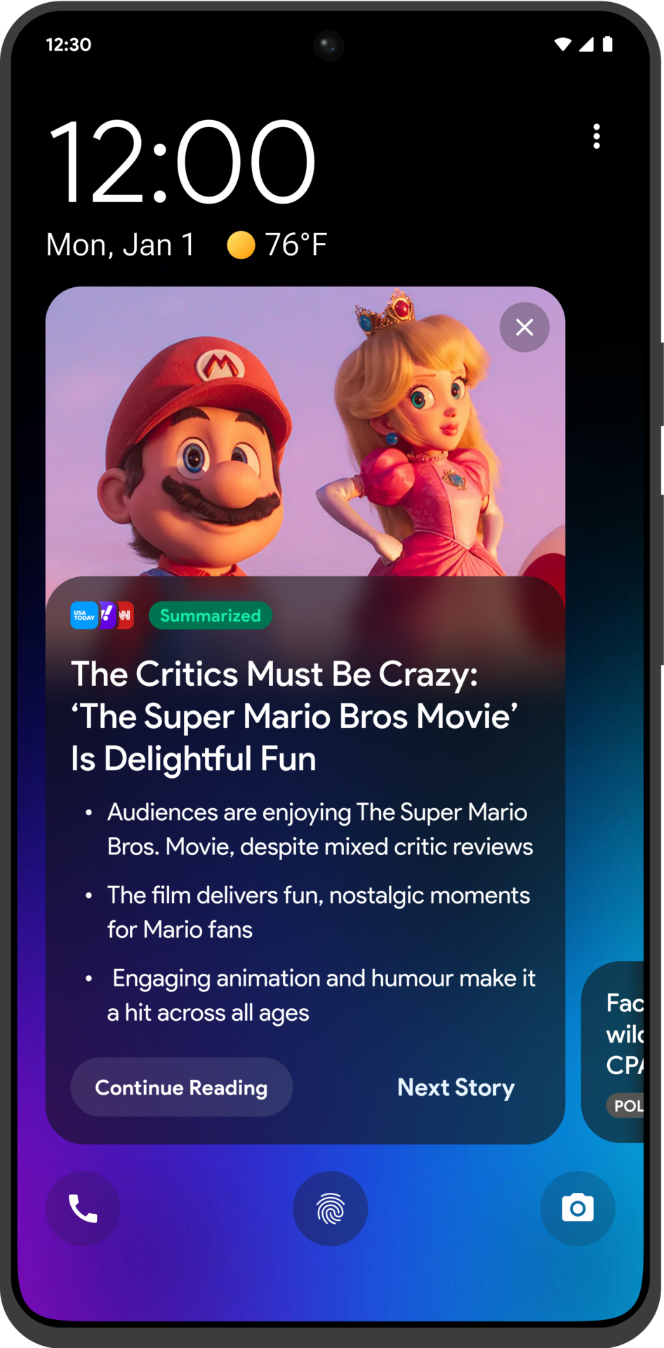
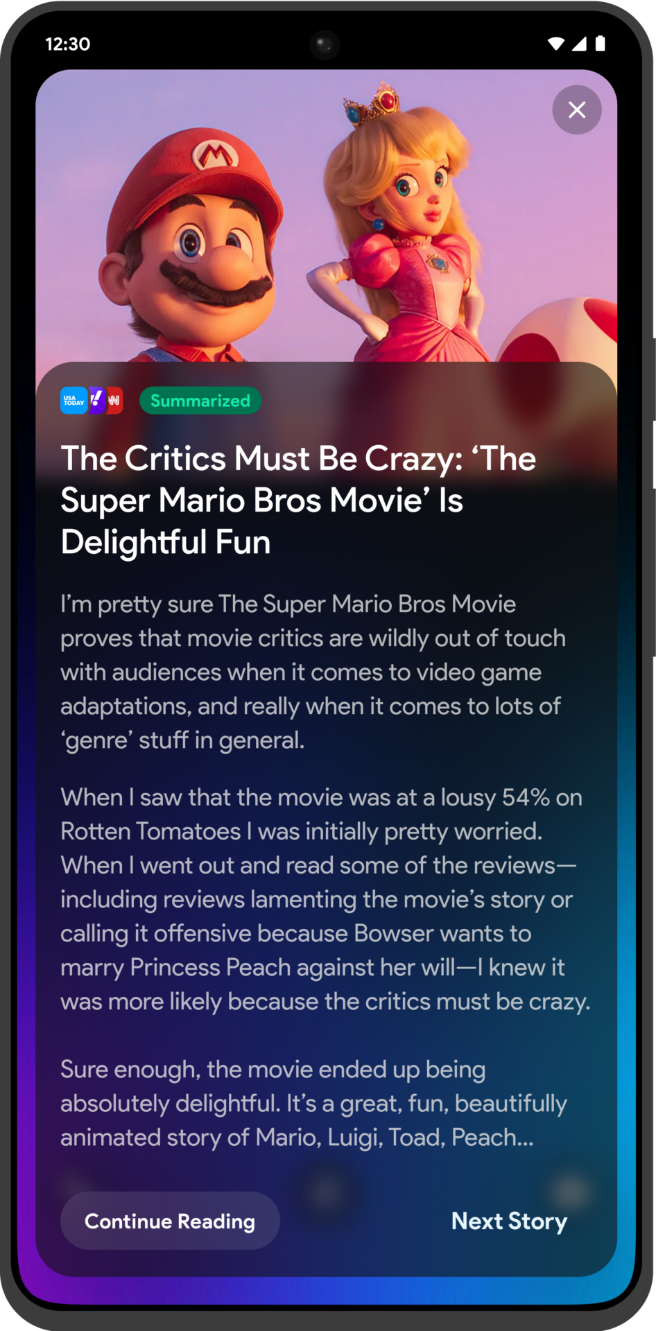
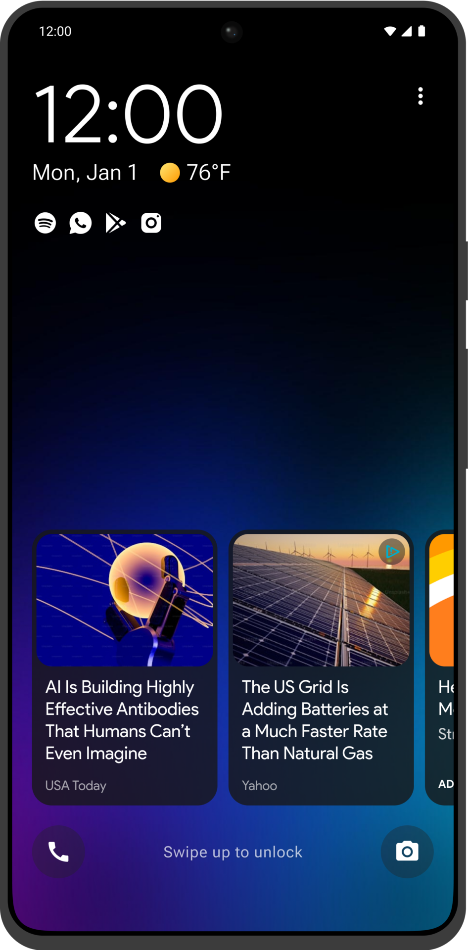
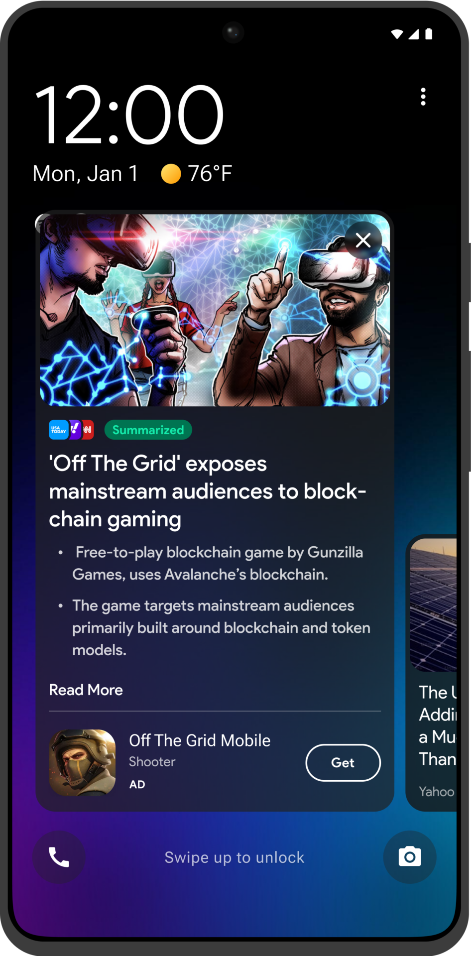
In our Lock Screen Apps, we leveraged AI-driven summarisation to deliver concise, engaging news summaries from multiple sources directly to users. This feature allowed users to quickly stay informed without needing to leave the lock screen, enhancing user engagement and accessibility. The AI summarisation offered different levels of content detail:
- Short Summary: A brief overview capturing the essence of the article.
- Large Summary: An expanded version with more in-depth coverage.
- Full Article: Access to the entire article for comprehensive reading.
Lock Screen Consumption
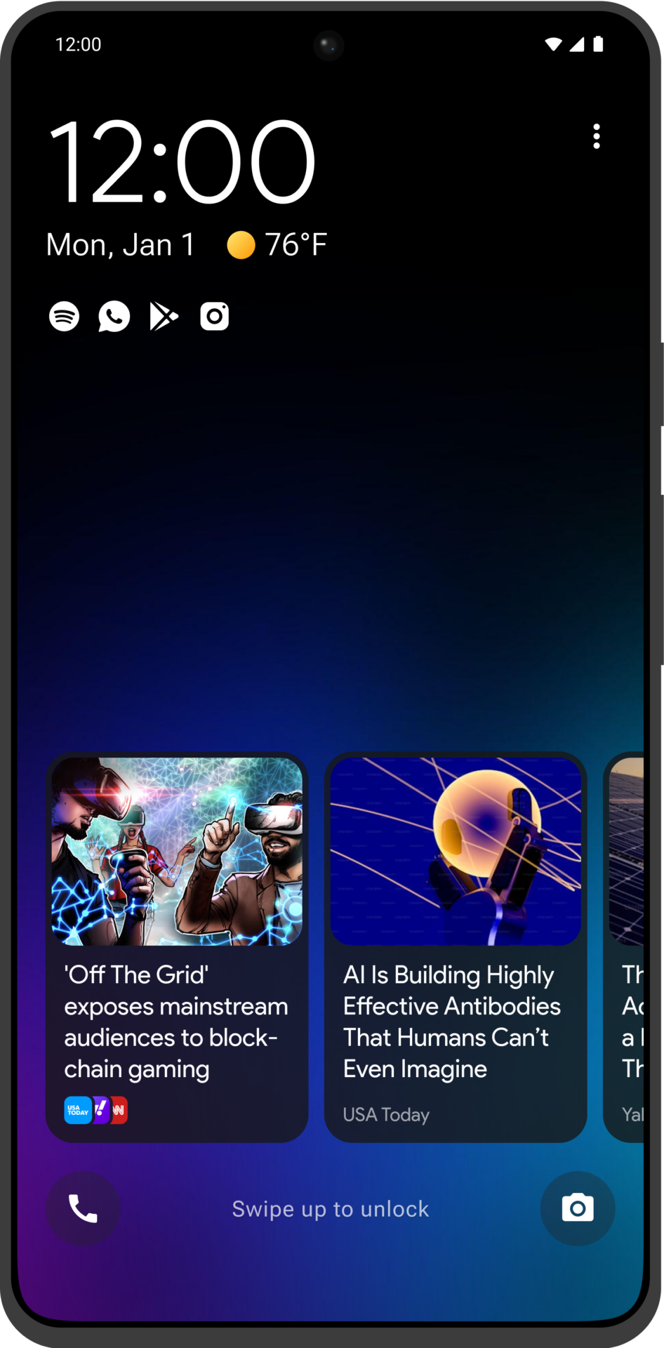
Building on our AI-powered summaries, we could now deliver these concise news updates directly on the lock screen, offering users instant access to the most relevant information at a glance. Users can explore articles further through deep-linking to other apps within our portfolio, balancing quick insights with the option for deeper engagement.
User Feedback
To enhance our advertising strategy, we integrated interstitial ads into our apps, strategically placing them at natural transition points. This approach has significantly boosted both engagement and revenue compared to traditional ad formats. By adopting interstitial ads, we maximise user attention during key moments, optimizing the effectiveness of our monetisation efforts.
Tier 1
Premium
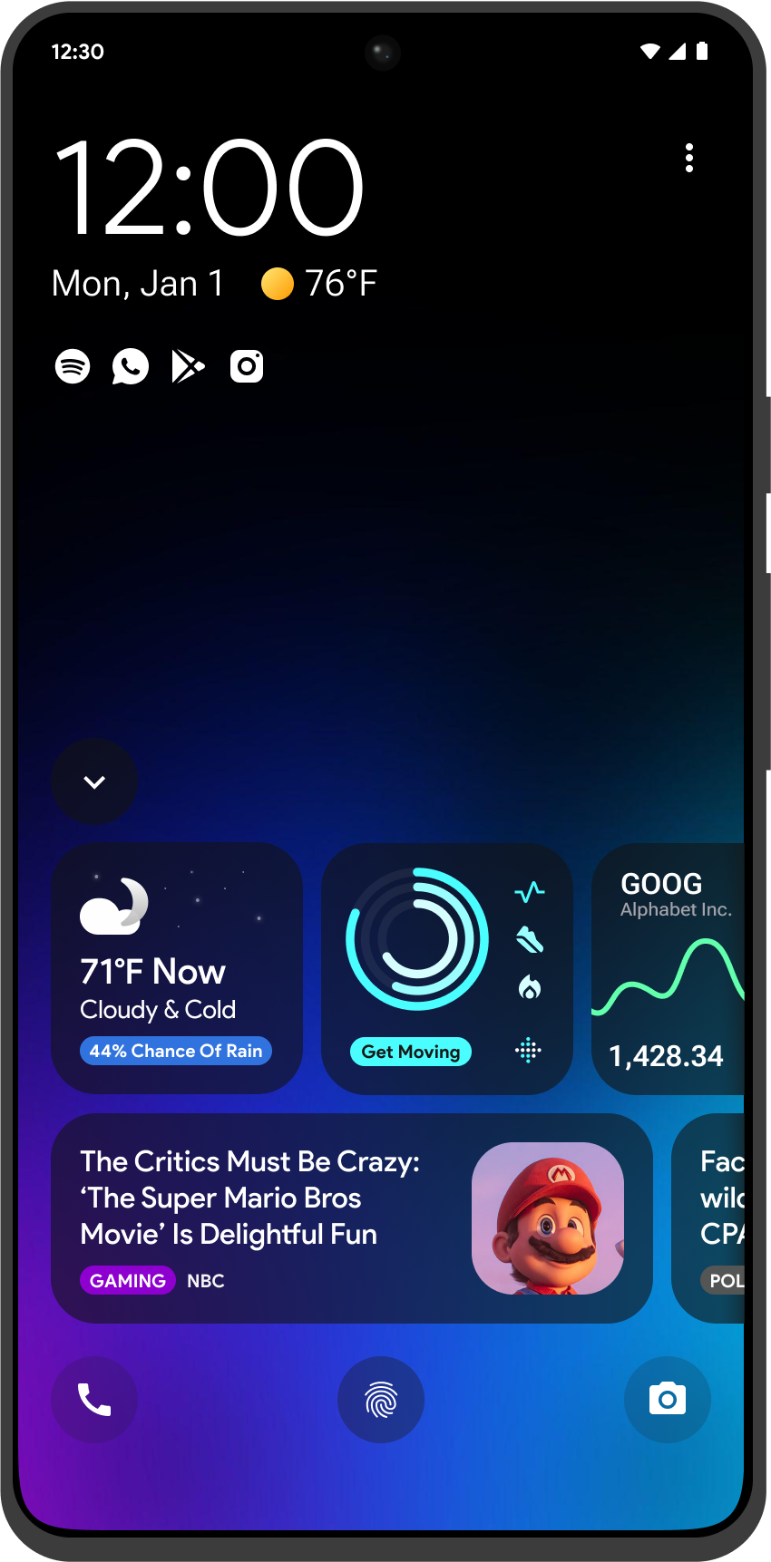
In our pursuit of innovation and meeting user demands, we embarked on developing a new version of our Lock screen app, with a strong emphasis on enhancing user engagement. Our goal was to create a pioneering product that fully integrates with the entire ecosystem and offers unprecedented customisation options for both users and partners, crafting a truly unique and tailored experience.
We incorporated third-party SDK’s and API’s to allow users to personalise their lock screen content according to their preferences. This new version, enriched with the latest features and technological advancements, has been enthusiastically received by both users and partners, establishing a novel proposition for the lock screen that stands out in the market.

Smart Ai Widgets
3rd Party App Integration
User Customisable

Custom Topics & Categories
Responsive Design
Responsive Design
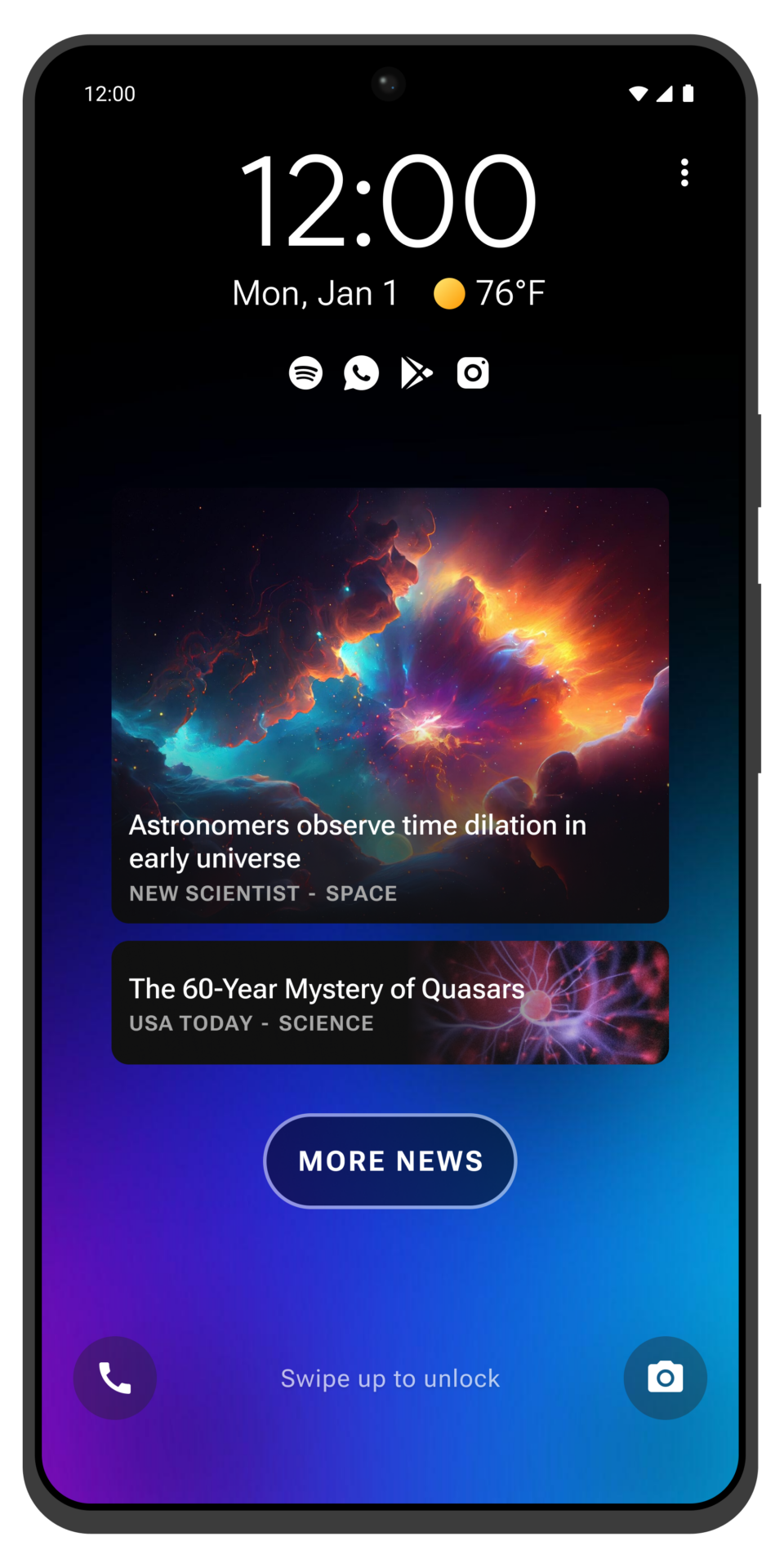
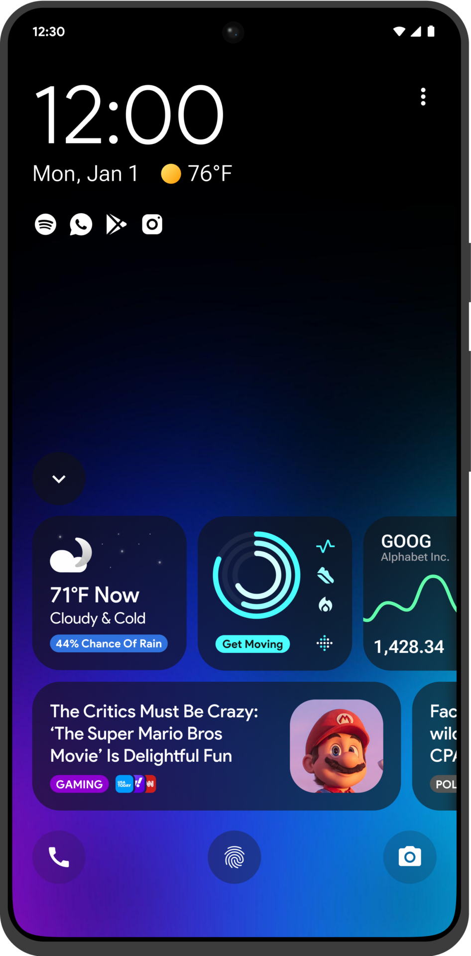
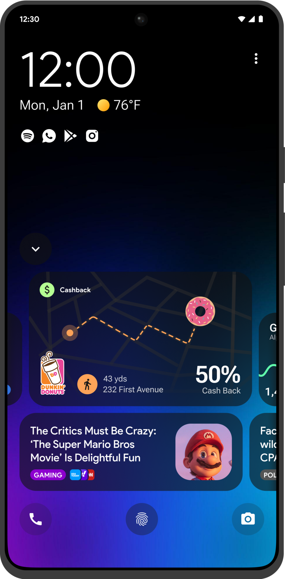
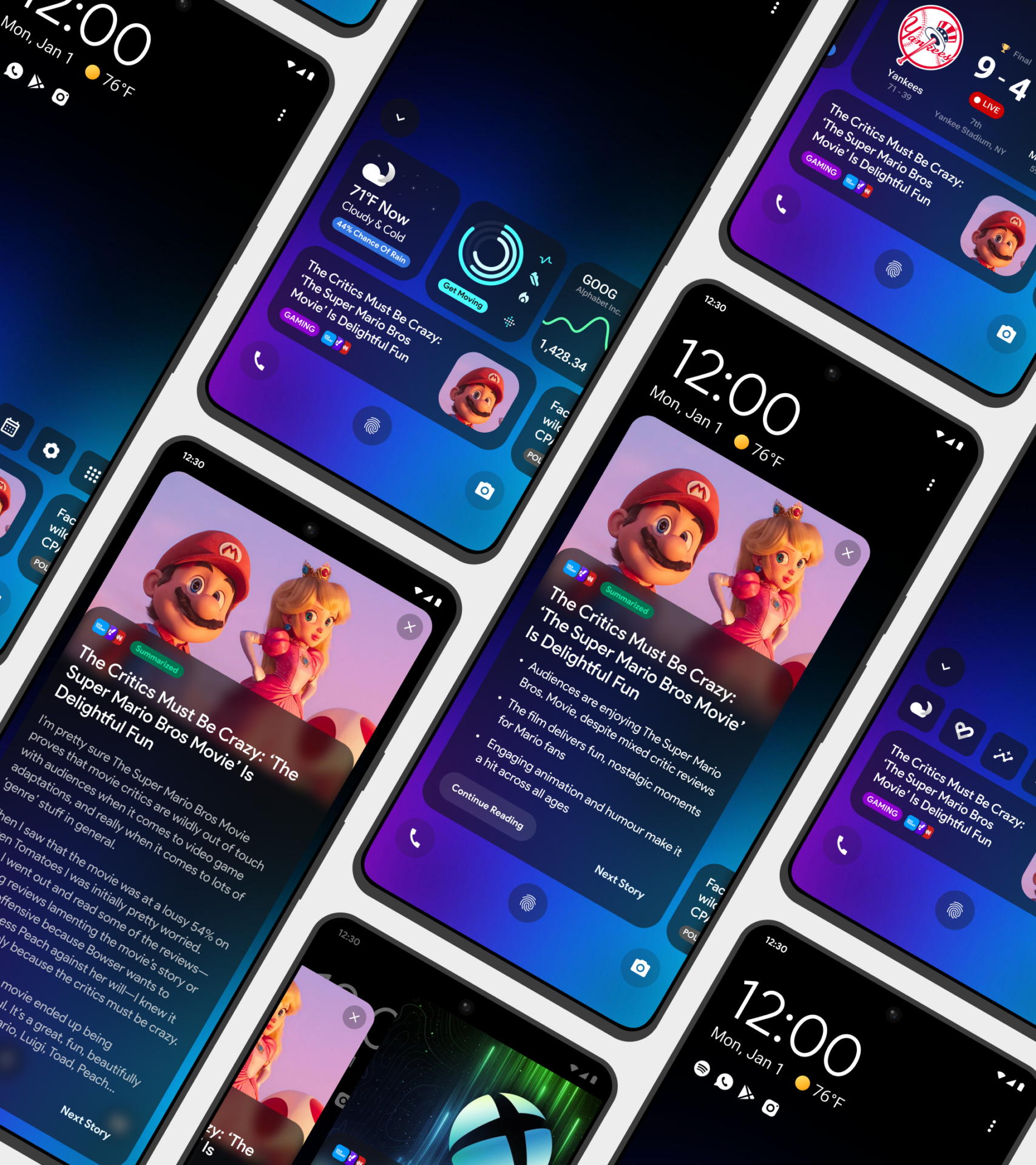
Our responsive design for the lock screen ensures a seamless, non-intrusive experience that encourages high user adoption. Users can easily glance at content and widgets for quick updates, with options to expand for more information when desired. This flexibility allows users to stay informed with minimal disruption while providing a pathway to dive deeper and access related apps directly.
Smart Ai Widgets
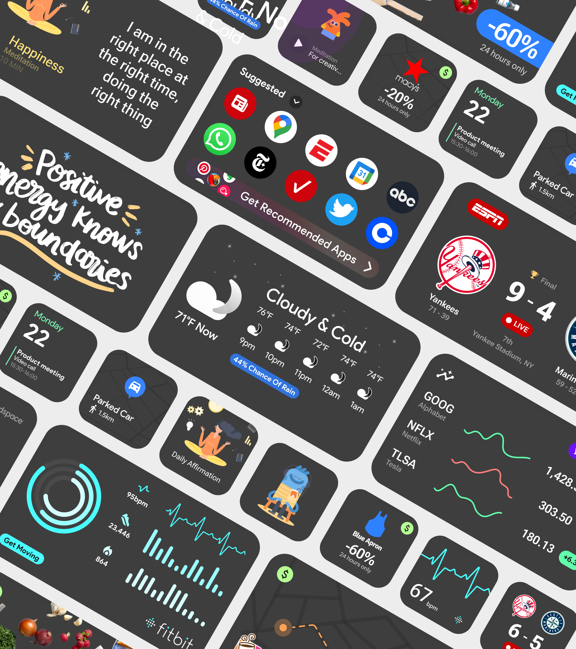
We harnessed AI to deliver timely, context-aware widgets and notifications directly on users’ lock screens. This “just-in-time” approach ensures users receive the most relevant information exactly when they need it, enhancing engagement and convenience without the need for app navigation.
- 'JIT' Alerts
- Live Widgets
- Transparent Design
- 3rd Party Integration
User Customisable
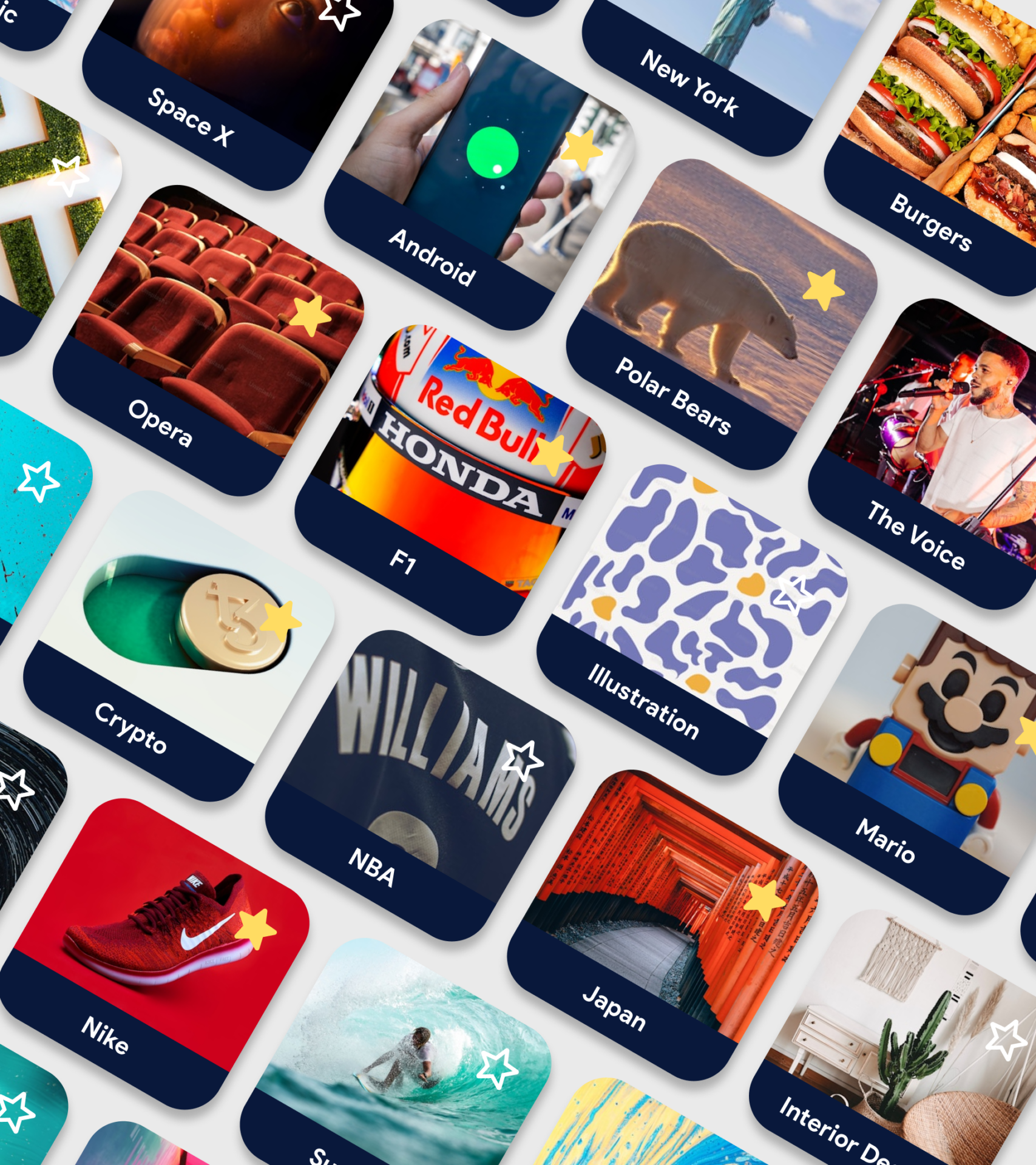
To personalise the user experience, we introduced Custom Topics, enabling users to fine-tune their news feed by selecting specific categories and interests. This feature allows for a more tailored, relevant experience, enhancing user engagement by delivering precisely the content they care about most. By offering users control over their content preferences, Custom Topics optimises engagement and fosters a deeper, more personalised connection with our apps.
- Custom Categories & Topics
- Like / Dislike Algorithm
- Lock Screen Shortcuts
- Customisable Layouts
Native Notifications
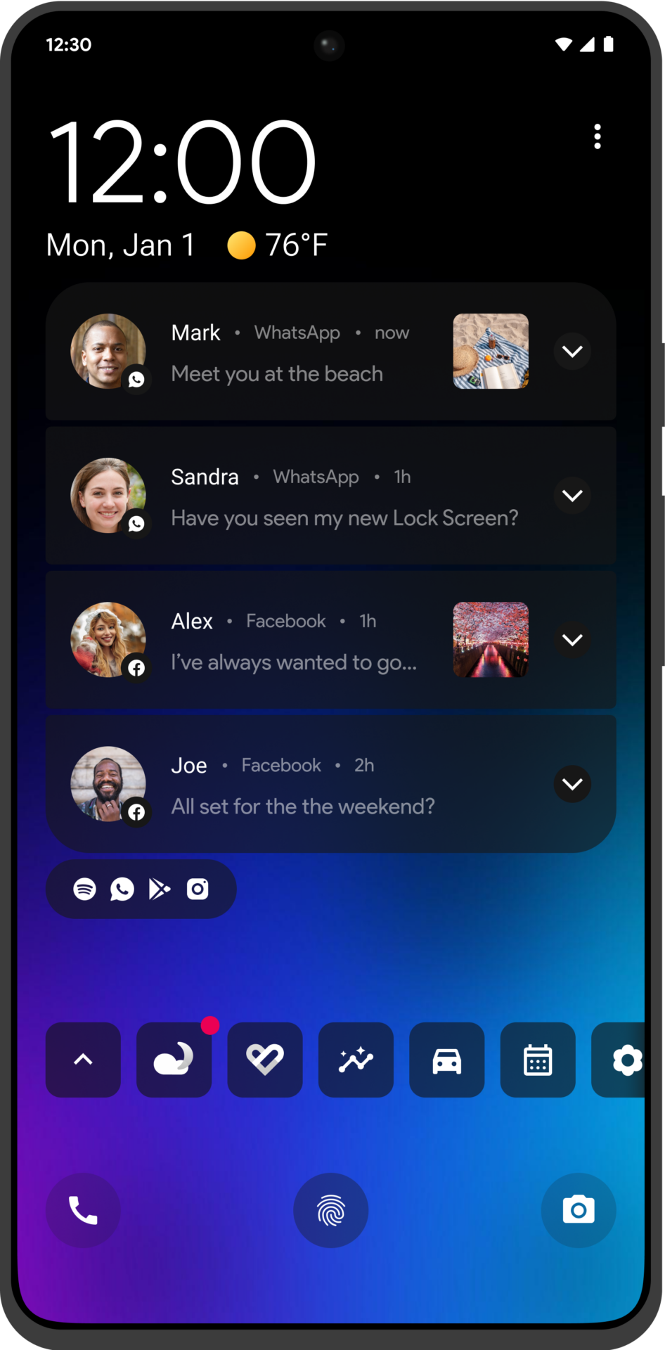
For our premium product, we prioritised creating a seamless, native notification experience that closely mirrored the familiarity of a device’s built-in notifications. User feedback indicated this was a critical area, so we focused on enhancing the Lock Screen without removing any core features. By deeply integrating with the Android operating system, we ensured that notifications felt intuitive and familiar, allowing users to interact naturally. This approach maintained the Lock Screen’s functionality while adding value, improving the overall user experience without compromising key updates and alerts.3rd Party Integration
Concept
CES 2020
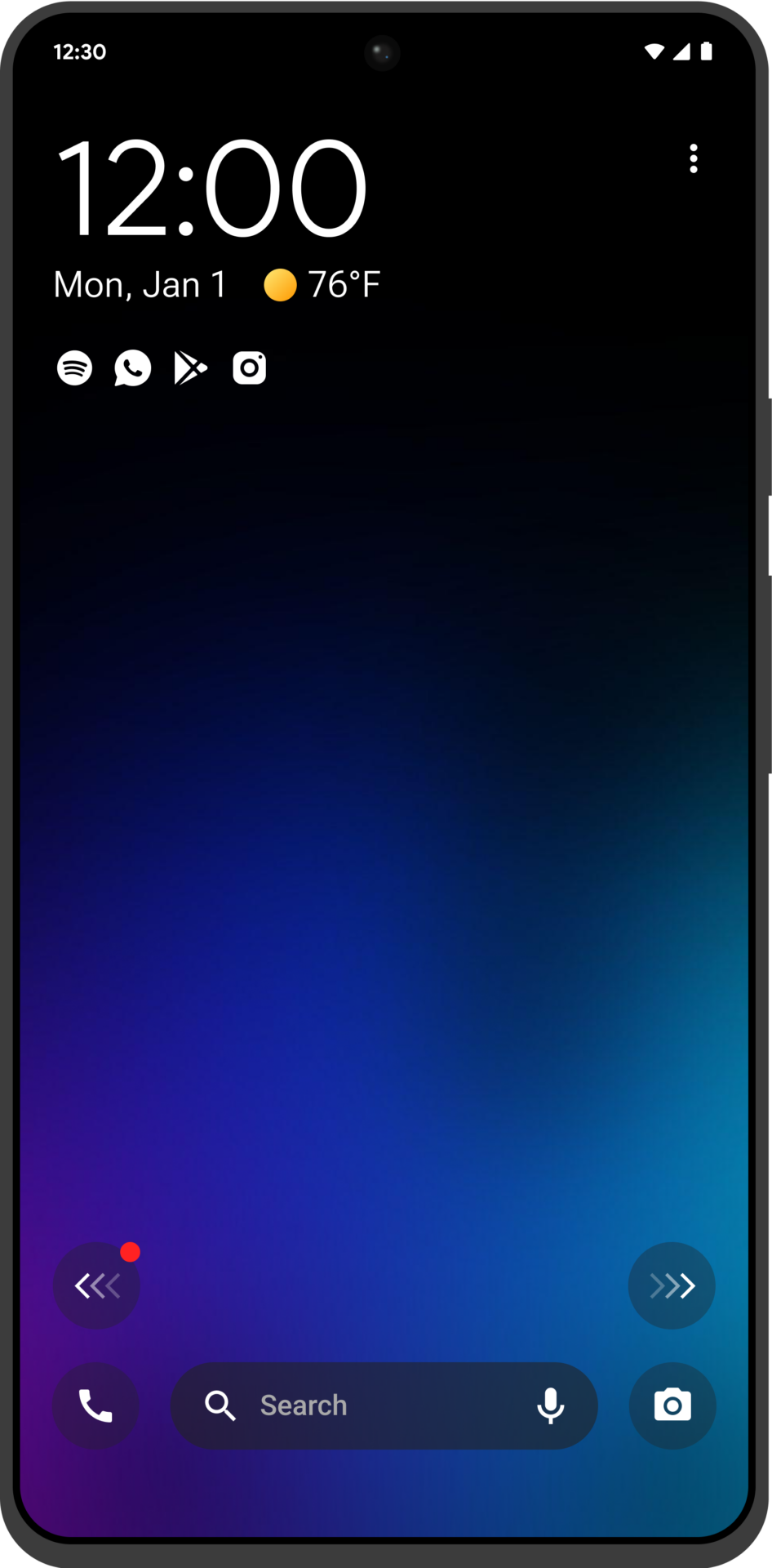
At CES, we introduced a conceptual version of our Headlines app, designed to showcase the future possibilities of the product. This version featured innovative swipe able lock screens: swiping left provided access to news, apps, and search functions, while swiping right displayed customisable user widgets. This demonstration highlighted the app’s potential for seamless content access and personalisation, underscoring our commitment to innovation and user-centred design. The showcase aimed to excite customers about the upcoming developments and versatility of the Headlines app.
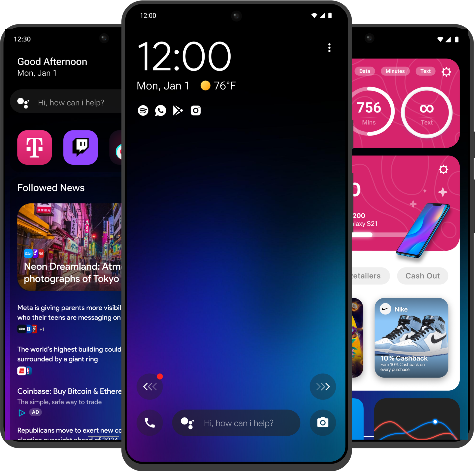
On Device Search
Native and Custom Widgets
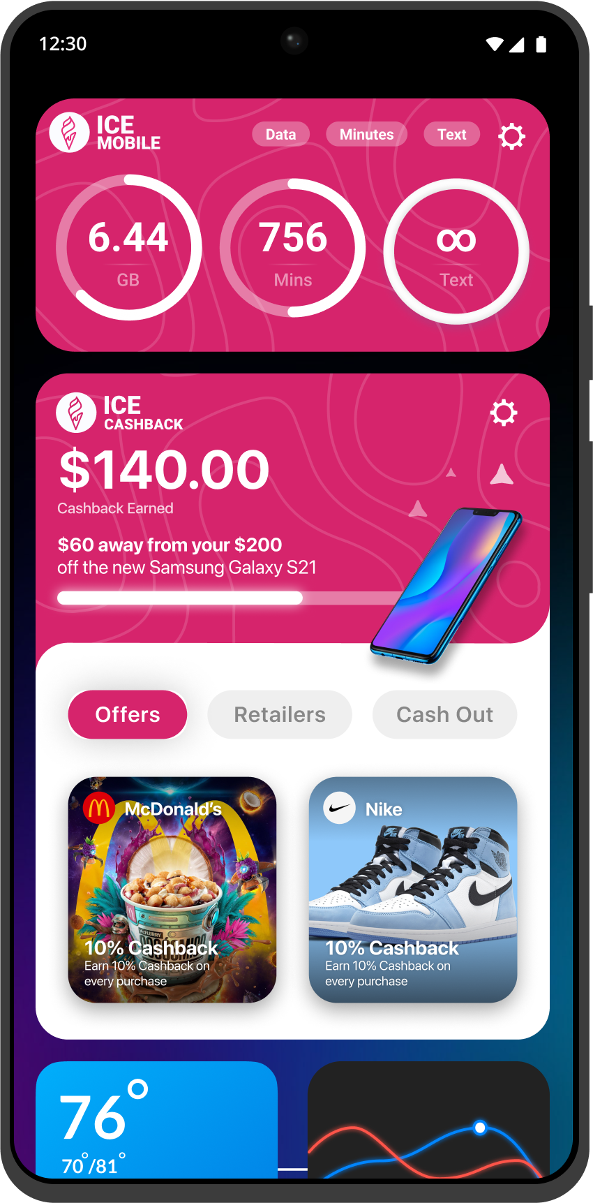
MNO Integrations
Truly Customisable
Ai Content Suggestion
New Real Estate
Our responsive design for the lock screen ensures a seamless, non-intrusive experience that encourages high user adoption. Users can easily glance at content and widgets for quick updates, with options to expand for more information when desired. This flexibility allows users to stay informed with minimal disruption while providing a pathway to dive deeper and access related apps directly.
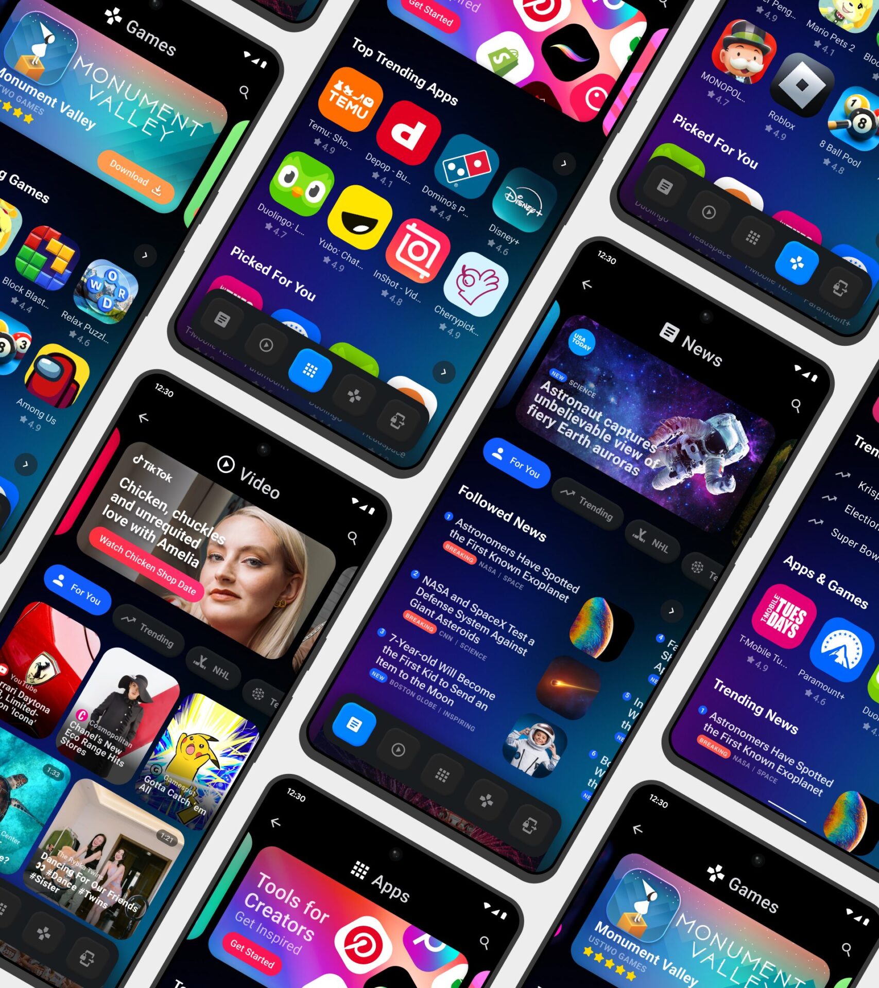
Content Feed
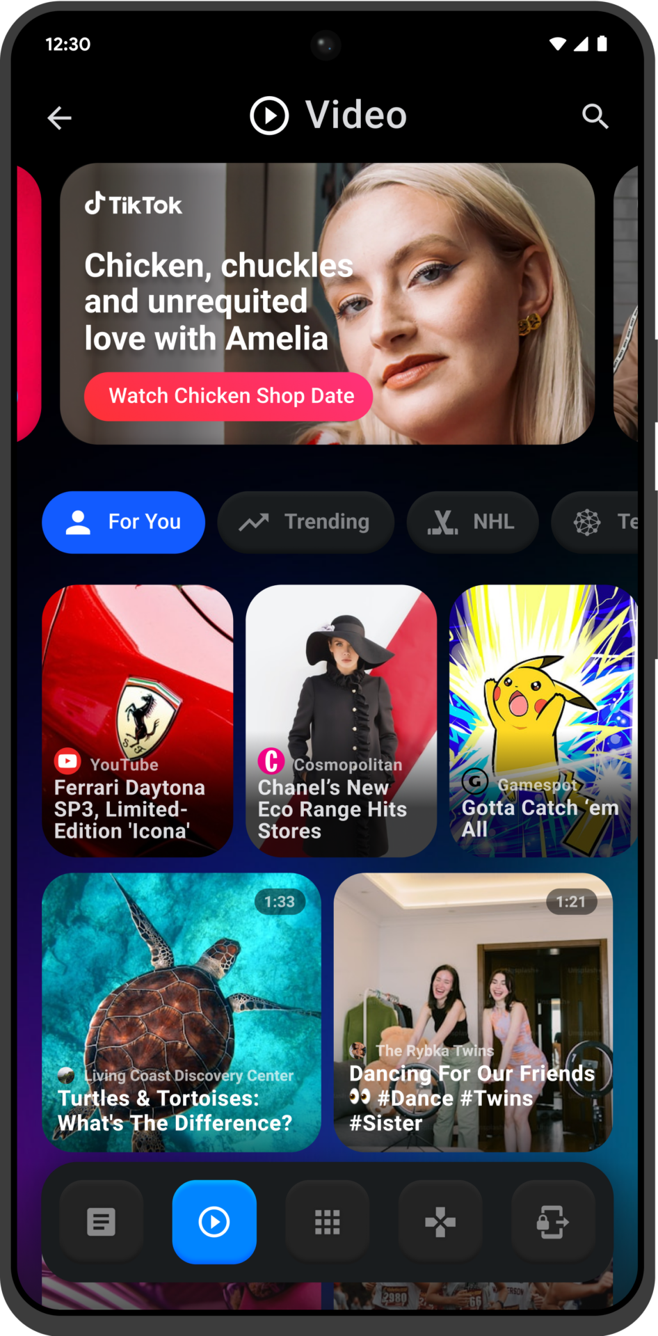
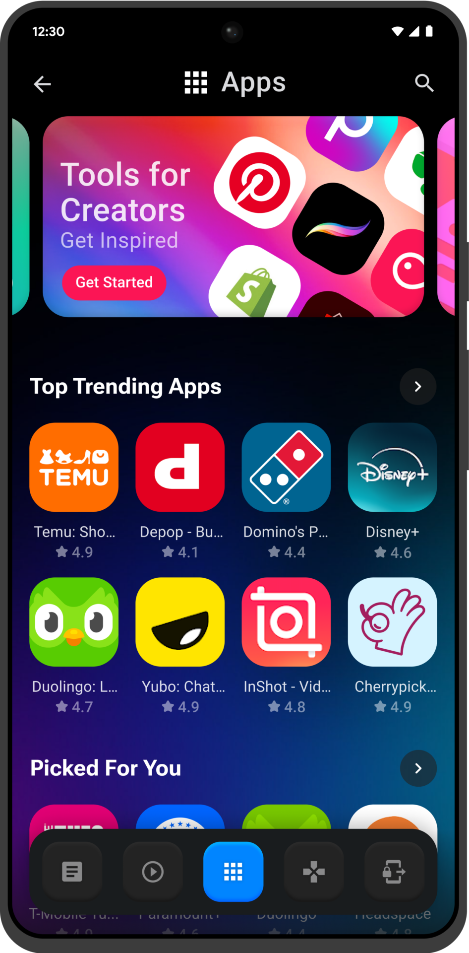
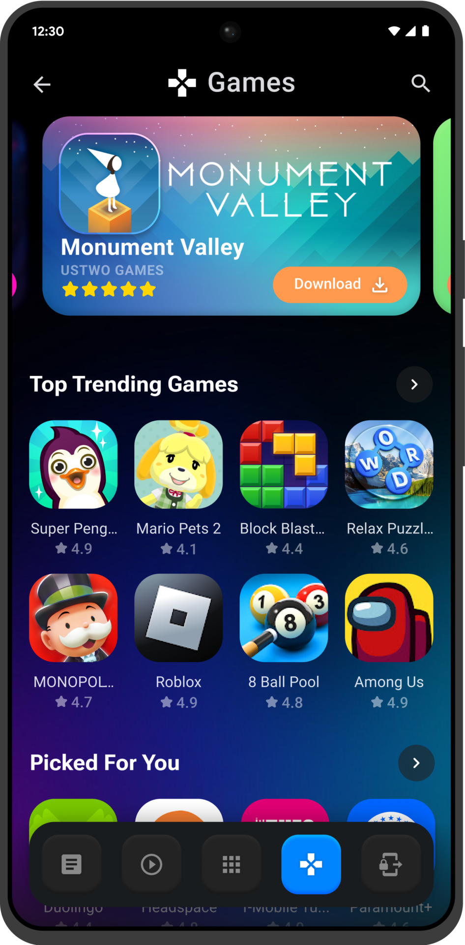
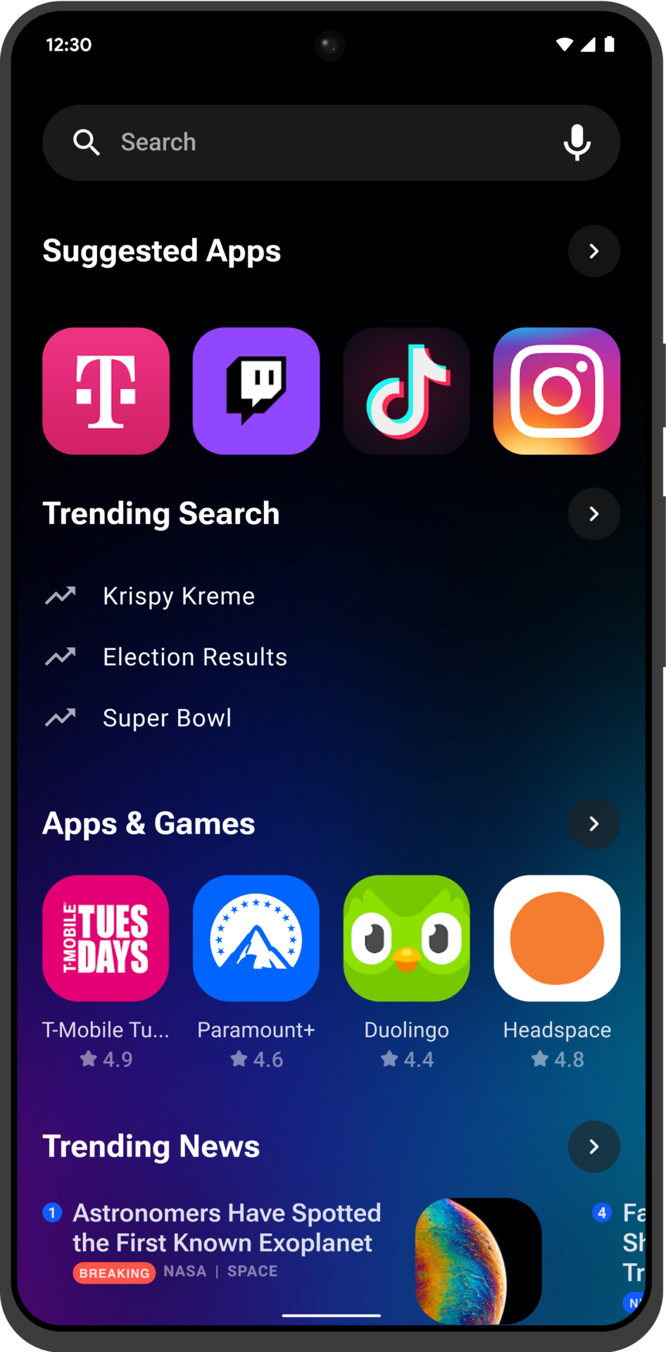
The -1 screen was designed to provide users with a personalised content experience directly from their Lock Screen. This feature enabled users to customise the type of content they wanted to see, making it easy to access what’s most important with a simple swipe. It was a dynamic way to engage with a wide range of content, all tailored to user preferences for quick and convenient access.
- News Content
- Video Content
- Device Search
- App and Games Downloads
- And many more…

Widgets
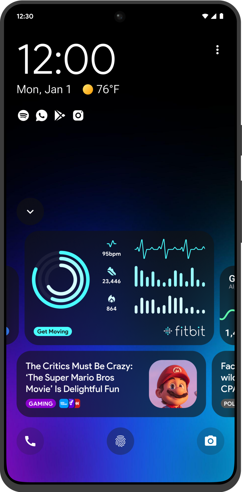
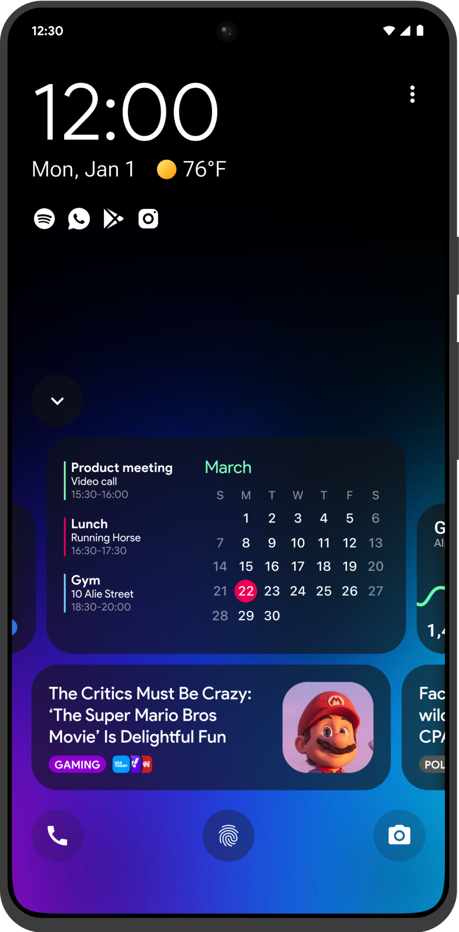
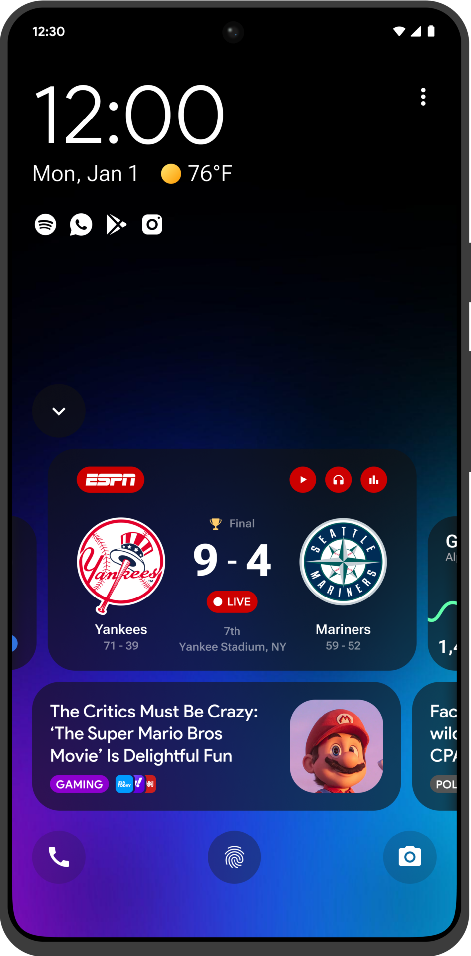
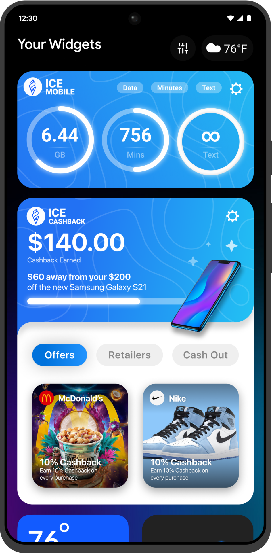
The +1 screen introduced both native and custom widgets, giving users quick access to essential information directly from their Lock Screen. This included familiar, native widgets and custom options that allowed for deeper integrations with partners and MNOs. The custom widgets opened up a variety of possibilities, making the experience both informative and engaging.
- Partner Widgets
- Sliide apps upsell and engagement opportunities
- Third-party & affiliate monetisation
- And many more…

Lifeline & Tier 2
Tablets
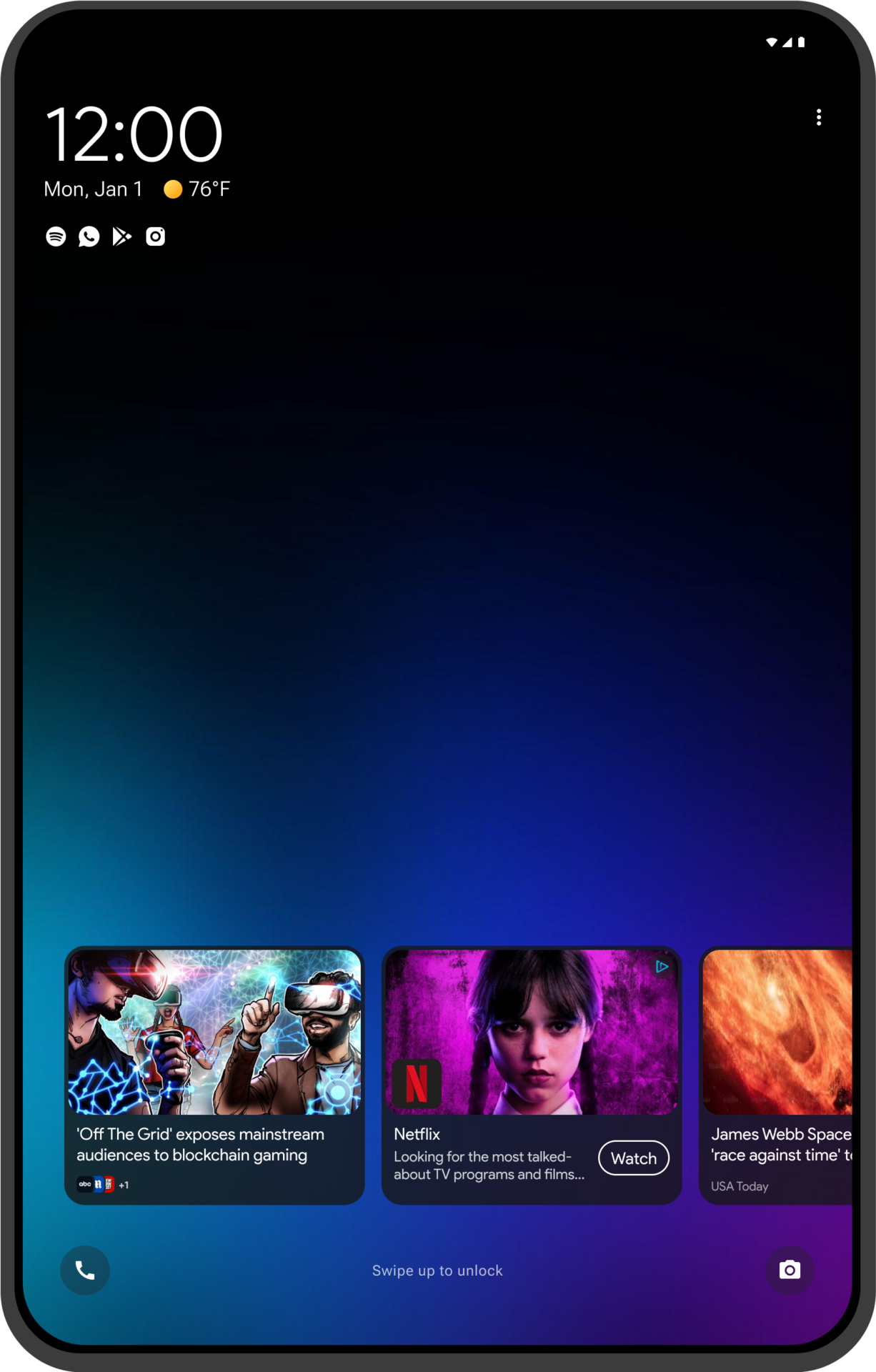
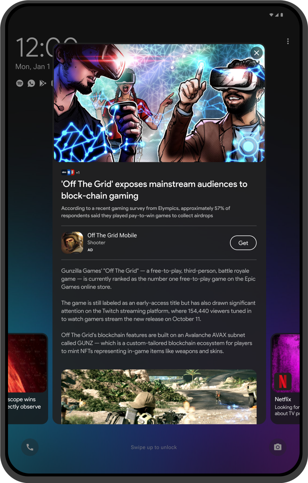
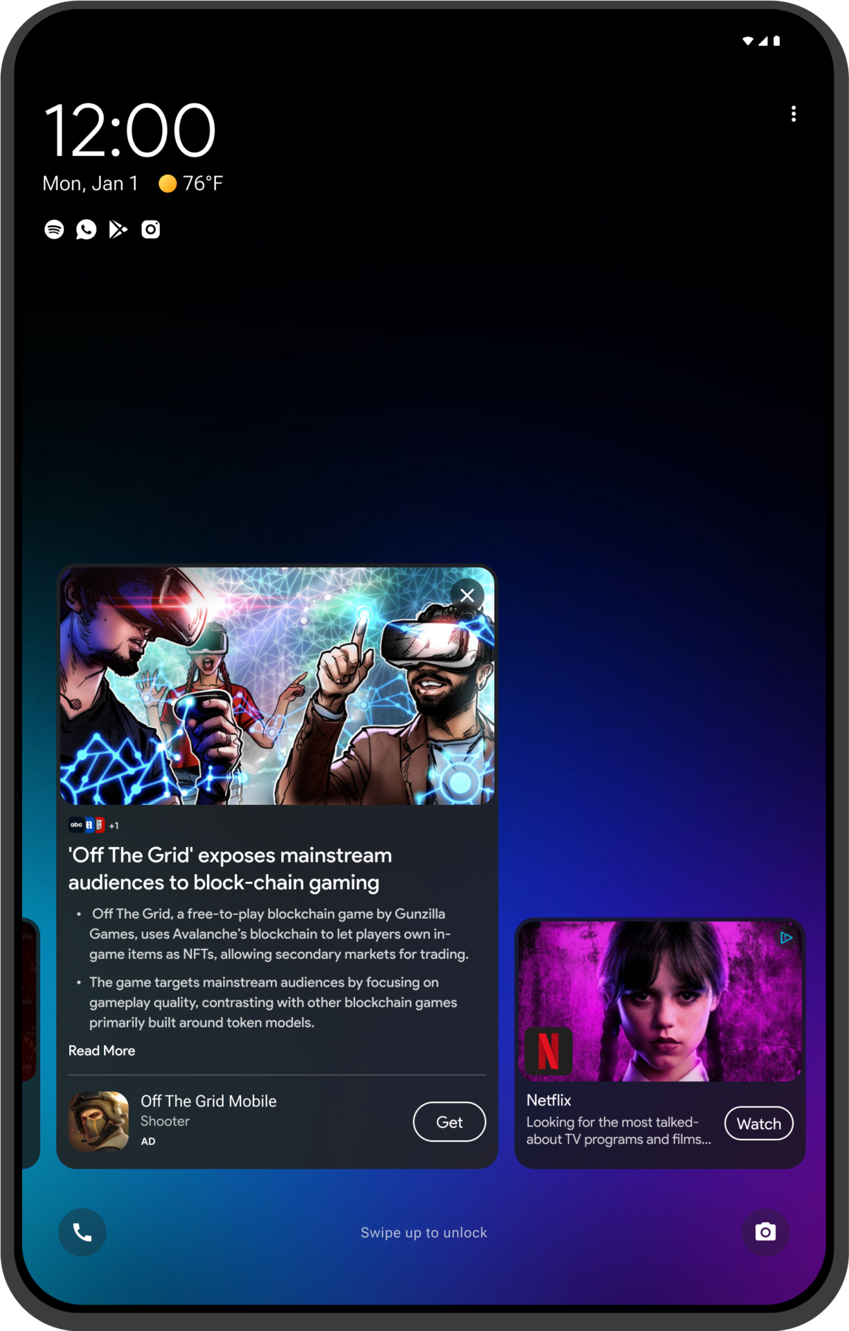
While updating our mobile applications, we simultaneously expanded our efforts to enhance our tablet offering. Recognising that many users in the ACP program use tablets, we aimed to leverage the additional screen real estate to its fullest potential. To ensure a consistent and appealing user experience across all device sizes, we developed versions of our lock screen apps optimised for tablets. These larger form factor versions capitalise on the bigger screens, enriching the user interface and functionality.
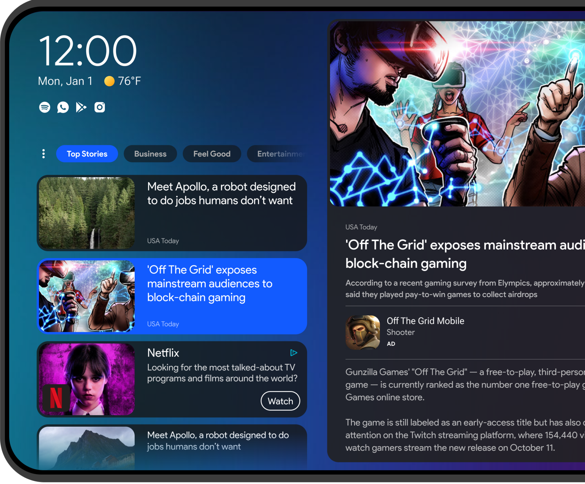
Orientation Support
Multi-Layer Consumption
Category Selection
Responsive Design
Dynamic Layouts
Tablet Opportunity
Our responsive design for the lock screen ensures a seamless, non-intrusive experience that encourages high user adoption. Users can easily glance at content and widgets for quick updates, with options to expand for more information when desired. This flexibility allows users to stay informed with minimal disruption while providing a pathway to dive deeper and access related apps directly.
Orientation Support
Our responsive design for the lock screen ensures a seamless, non-intrusive experience that encourages high user adoption. Users can easily glance at content and widgets for quick updates, with options to expand for more information when desired. This flexibility allows users to stay informed with minimal disruption while providing a pathway to dive deeper and access related apps directly.
Lock Screen Consumption
Our responsive design for the lock screen ensures a seamless, non-intrusive experience that encourages high user adoption. Users can easily glance at content and widgets for quick updates, with options to expand for more information when desired. This flexibility allows users to stay informed with minimal disruption while providing a pathway to dive deeper and access related apps directly.

